Container Components in Vue.js: Advanced Component Composition
Note: This is the fourth part of my “Advanced Vue.js Application Architecture” series on how to structure and test large scale Vue.js applications. Stay tuned, there’s more to come! Follow me on Twitter if you don’t want to miss the next article.
<< First < Previous Next >
When building large scale applications where it is a top priority to achieve high test coverage, you are often faced with the problem that it becomes complicated to test some of the components of the application. A common reason for this is that you have to mock a lot of global dependencies like the Vue Router or the Vuex Store, and other parts of your code that induce side effects like data fetching logic.
One way to work around these problems is to separate your components into two categories: Container Components and Presentational Components.
Container Components and Presentational Components
I’ve first read about the concept of Container Components in the context of React applications. Dan Abramov himself wrote an article about how to use this pattern to write better React applications.
Container Components are not concerned with how things look but only with fetching data and initializing one or multiple Presentational or other Container Components. When using this pattern, only Container Components are allowed to fetch data from an API or communicate with the Vuex Store.
In contrast, only Presentational Components are permitted to render their own markup. But Presentational Components are also allowed to contain other Presentational Components and even Container Components. This does not negatively affect testability because we usually use shallow mounting in unit testing, which means that child components are not rendered. Therefore, we don’t have to mock their dependencies.
By dividing our components into these two categories, we end up with a lot of very simple and easy to test Presentational Components and some hard to test Container Components. I recommend that you don’t write any unit tests at all for Container Components and use integration tests instead. But even if you decide to write unit tests for Container Components, testing the application as a whole will still be easier because there are only a few components where you need to mock API calls or the Vuex Store.
Building a demo application
To demonstrate the basic concepts of this pattern, we build a demo application that applies these principles. Our application will have three pages: a homepage, a product listing page and an article listing page.
The homepage will have a teaser section with the top three products and also another teaser with the top three articles. The two list pages consist of a filter bar, the listing of the products or articles and a pagination navigation.
We’ll use a test-driven approach to build our application. This means that we’ll first write a failing test and then write just enough code to make it pass. We’ll repeat this process until our application is finished. However, there are some exceptions, e.g. we will not test any UI Components.
If you want to take a look at the project setup as a whole, you can check out the GitHub repository. Additionally you can view a live demo of the application on Netlify.
The basic building blocks: UI Components
This article is the third one in a series of articles about structuring Vue.js projects. In the first article of this series we’ve already explored how we can build powerful UI Components. We use both the UiGrid and the UiMedia component which we’ve created in the previous article. Additionally we create a new UiCard component to display our products.
<script>
export const UiCard = {
  props: {
    tag: {
      default: 'div',
      type: String,
    },
  },
  render() {
    const Tag = this.tag;
    return (
      <Tag class="UiCard">
        {this.$slots.default}
      </Tag>
    );
  },
};

export const UiCardBody = {
  props: {
    tag: {
      default: 'div',
      type: String,
    },
  },
  render() {
    const Tag = this.tag;
    return (
      <Tag class="UiCard__body">
        {this.$slots.default}
      </Tag>
    );
  },
};

export default UiCard;
</script>

<style lang="scss">
.UiCard {
  overflow: hidden;
  border: 1px solid #dfdfdf;
  border-radius: 0.25rem;
  background-color: #fff;
}

.UiCard__body {
  padding: 1em;
}
</style>
We’ll later use our UI Components to build more specific product and article components out of them.
Do you want to learn more about building advanced Vue.js applications?
Register for the Newsletter of my upcoming book: Advanced Vue.js Application Architecture.
The NavFilter component
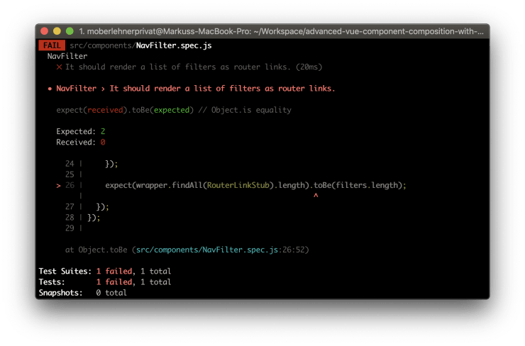
Now that we’ve set up all the UI Components we need to build our product listing, let’s start with the first a little more complex component. The NavFilter component should render a list of filters (e.g. product categories or tags). Because we want our users to be able to get to a certain filter directly via a link, we want the NavFilter component to work with good old URL query parameters. This means we can use the RouterLink component provided by Vue Router instead of rolling our own logic.
// src/components/NavFilter.spec.js
import { RouterLinkStub, shallowMount } from "@vue/test-utils";

import NavFilter from "./NavFilter.vue";

describe("NavFilter", () => {
  test("It should render a list of filters as router links.", () => {
    const filters = [
      {
        id: "foo",
        name: "Foo",
      },
      {
        id: "bar",
        name: "Bar",
      },
    ];
    const wrapper = shallowMount(NavFilter, {
      propsData: {
        filters,
      },
      stubs: {
        RouterLink: RouterLinkStub,
      },
    });

    expect(wrapper.findAll(RouterLinkStub).length).toBe(filters.length);
  });
});
As I promised: we start by writing our test first. Let’s create an empty component file next in order to make it possible to, at least theoretically, pass our test.
<template>
  <div :class="$style.wrap" />
</template>

<script>
export default {
  name: "NavFilter",
};
</script>
If we now run npm run test:unit -- src/components/NavFilter.spec.js we can see the test fail. Although it seems pointless at first, I highly recommend you to make it a habit to run a newly written test to see it fail, even though you are sure it will fail because sometimes you make a mistake and they don’t. A test that always passes is pointless. The next step is to make our test pass.
<template>
  <div :class="$style.wrap">
    <ul :class="$style.list">
      <li v-for="filter in filters" :key="filter.id" :class="$style.listItem">
        <RouterLink> {{ filter.name }} </RouterLink>
      </li>
    </ul>
  </div>
</template>

<script>
export default {
  name: "NavFilter",
  props: {
    filters: {
      default: () => [],
      type: Array,
    },
  },
};
</script>
If we run npm run test:unit -- src/components/NavFilter.spec.js again, our test should now pass.
Next we want to make sure the correct to property is passed to the router link component. We want to pass a filter query param to the router link.
// src/components/NavFilter.spec.js
// ...

describe("NavFilter", () => {
  // ...

  test("It should pass the filter id as a query param to the router link.", () => {
    const filters = [
      {
        id: "foo",
        name: "Foo",
      },
    ];
    const wrapper = shallowMount(NavFilter, {
      propsData: {
        filters,
      },
      stubs: {
        RouterLink: RouterLinkStub,
      },
    });

    expect(wrapper.find(RouterLinkStub).props("to")).toEqual({
      query: { filter: "foo" },
    });
  });
});
We have to make some adjustments to our code to make the new test pass.
         :class="$style.listItem"
       >
-        <RouterLink>
+        <RouterLink
+          :to="{ query: { filter: filter.id } }"
+        >
           {{ filter.name }}
         </RouterLink>
So far so good, but we also want to be able to have some kind of default filter which basically clears the URL from all filter params. We can do this by passing an empty object to the RouterLink.
// src/components/NavFilter.spec.js
// ...

describe("NavFilter", () => {
  // ...

  test('It should pass an empty object to the router link if the filter id is "all".', () => {
    const filters = [
      {
        id: "all",
        name: "All",
      },
    ];
    const wrapper = shallowMount(NavFilter, {
      propsData: {
        filters,
      },
      stubs: {
        RouterLink: RouterLinkStub,
      },
    });

    expect(wrapper.find(RouterLinkStub).props("to")).toEqual({});
  });
});
We can make this test pass by checking if the filter id equals all and pass an empty object to the RouterLink to property if this is the case.
         :class="$style.listItem"
       >
         <RouterLink
-          :to="{ query: { filter: filter.id } }"
+          :to="filter.id !== 'all' ? { query: { filter: filter.id } } : {}"
         >
           {{ filter.name }}
         </RouterLink>
It might be tempting to also test what happens if one of those router links is clicked, but that’s not something our NavFilter component is concerned with. When testing our component, we expect the RouterLink component to just work.
If you want to see the full code of the NavFilter component, including its styles, you can take a look at it at GitHub.
The NavPagination component
Although it might not be completely obvious at first our NavPagination component works pretty similar to the NavFilter component. Again we want our component to utilize query parameters in order to make it possible to access certain product pages via an URL. But this time it gets a bit more complex, as it seems at first glance. Let’s start with the first specification.
// src/components/NavPagination.spec.js
import { shallowMount } from "@vue/test-utils";

import NavPagination from "./NavPagination.vue";

describe("NavPagination", () => {
  const disabledClass = "is-disabled";

  // ...

  describe("First page link", () => {
    const firstPageLinkSelector = '[data-qa="first page link"]';

    test("It should be disabled on page 1.", () => {
      const wrapper = shallowMount(NavPagination, {
        propsData: {
          routeQuery: { page: 1 },
        },
      });
      const firstPageLink = wrapper.find(firstPageLinkSelector);

      expect(firstPageLink.is("span")).toBe(true);
      expect(firstPageLink.classes().includes(disabledClass)).toBe(true);
    });
  });
});
We could add a test for checking if the first page link is rendered at all, but usually I don’t recommend you to simply check if something is rendered if no logic (like a v-if or a v-for) is determining if it is rendered or not. So we start be checking if the link is disabled in case the current page is the first one. Next you can see the code required to make this test pass.
<template>
<div :class="$style.wrap">
<Component
:is="currentPage > 1 ? 'router-link' : 'span'"
:class="[$style.control, { [$style['is-disabled']]: currentPage === 1 }]"
aria-label="turn to page 1"
data-qa="first page link"
>
⟪
</Component>
</div>
</template>
<script>
export default {
name: "NavPagination",
props: {
routeQuery: {
default: () => ({}),
type: Object,
},
},
computed: {
currentPage() {
const page = this.routeQuery.page || 1;
return parseInt(page, 10);
},
},
};
</script>In the next step we want to make sure that the first page link leads back to, well, the first page. Because the first page is the default page and doesn’t need any query param like page=1 we want to make sure no such query param is added.
// src/components/NavPagination.spec.js
import { RouterLinkStub, shallowMount } from "@vue/test-utils";

import NavPagination from "./NavPagination.vue";

describe("NavPagination", () => {
  // ...

  describe("First page link", () => {
    // ...

    test("It should link back to page 1 without a page query param.", () => {
      const wrapper = shallowMount(NavPagination, {
        propsData: {
          routeQuery: {
            foo: "foo",
            page: 2,
          },
        },
        stubs: {
          RouterLink: RouterLinkStub,
        },
      });
      const firstPageLink = wrapper.find(firstPageLinkSelector);

      expect(firstPageLink.is(RouterLinkStub)).toBe(true);
      expect(firstPageLink.props("to")).toEqual({ query: { foo: "foo" } });
    });
  });
});
After making sure our tests fail, by running npm run test:unit -- src/components/NavPagination.spec.js again, we try to make it pass by writing some more code.
<template>
<div :class="$style.wrap">
<Component
:is="currentPage > 1 ? 'router-link' : 'span'"
+ :to="{ query: routeQueryWithoutPage }"
:class="[
$style.control,
{ [$style['is-disabled']]: currentPage === 1 }
]"
aria-label="turn to page 1"
data-qa="first page link"
>
⟪
</Component>
</div>
</template>
<script>
export default {
name: 'NavPagination',
props: {
routeQuery: {
default: () => ({}),
type: Object,
},
},
computed: {
currentPage() {
const page = this.routeQuery.page || 1;
return parseInt(page, 10);
},
+ routeQueryWithoutPage() {
+ const query = { ...this.routeQuery };
+ delete query.page;
+ return query;
+ },
},
};
</script>Because this article would become very, very long if I describe the process of writing every single test, I’ll stop here. You can take a look at the complete test code and also the complete code of the component at GitHub.
The ProductCard component
Next up is the ProductCard component which is responsible for rendering a preview of a product. This component does not contain any logic, so we could treat it as an UI Component and don’t test it at all. But because I like simple and strict rules like “All Presentational Components, except UI components, are tested.” more than hardly enforceable rules like “All Presentational Components, except UI Components and other components that make little sense to be tested, are tested.” I still tend to add a simple unit test which verifies if the component is at least mounted correctly.
// src/components/ProductCard.spec.js
import { shallowMount } from "@vue/test-utils";

import ProductCard from "./ProductCard.vue";

describe("ProductCard", () => {
  test(`It should mount.`, () => {
    const wrapper = shallowMount(ProductCard, {
      propsData: {
        img: "foo.jpg",
        name: "Foo",
        price: "100",
      },
    });

    expect(wrapper.is("uicard-stub")).toBe(true);
  });
});
This also has the benefit of the test file already being present in case the component becomes more complex at some point.
<template>
  <UiCard>
    <img :src="img" alt="" :class="$style.img" />
    <UiCardBody>
      <h3 :class="$style.name">{{ name }}</h3>
      <div :class="$style.price">€ {{ price }}</div>
    </UiCardBody>
  </UiCard>
</template>

<script>
import { UiCard, UiCardBody } from "./ui/UiCard.vue";

export default {
  name: "ProductCard",
  components: {
    UiCard,
    UiCardBody,
  },
  props: {
    img: {
      required: true,
      type: String,
    },
    name: {
      required: true,
      type: String,
    },
    price: {
      required: true,
      type: String,
    },
  },
};
</script>

<style lang="scss" module>
.img {
  width: 100%;
}

.name {
  font-size: 1.5em;
}

.price {
  margin-top: 0.5em;
  font-size: 1.25em;
}
</style>
The ProductGrid component
Our next component is also pretty straightforward. It is responsible for rendering a list of ProductCard components in a grid layout using the UiGrid component.
// src/components/ProductGrid.spec.js
import { shallowMount } from "@vue/test-utils";

import ProductGrid from "./ProductGrid.vue";

describe("ProductGrid", () => {
  // ...

  test("It should render a list of product cards.", () => {
    const products = [
      {
        img: "foo.jpg",
        name: "Foo",
        price: "100",
      },
      {
        img: "bar.jpg",
        name: "Bar",
        price: "200",
      },
    ];
    const wrapper = shallowMount(ProductGrid, {
      propsData: {
        products,
      },
    });

    expect(wrapper.findAll("productcard-stub").length).toBe(products.length);
  });
});
Don’t forget to see the test fail: npm run test:unit -- src/components/ProductGrid.spec.js. Next we can implement the component.
<template>
  <UiGrid>
    <UiGridItem
      v-for="product in products"
      :key="product.name"
      :width="['12/12', '4/12@m']"
    >
      <ProductCard
        :img="product.img"
        :name="product.name"
        :price="product.price"
      />
    </UiGridItem>
  </UiGrid>
</template>

<script>
import { UiGrid, UiGridItem } from "./ui/UiGrid.vue";
import ProductCard from "./ProductCard.vue";

export default {
  name: "ProductGrid",
  components: {
    ProductCard,
    UiGrid,
    UiGridItem,
  },
  props: {
    products: {
      default: () => [],
      type: Array,
    },
  },
};
</script>
The ProductTeaserContainer component
Now we can create our first Container Component. The ProductTeaserContainer will be used to render the product teaser on our homepage. Because this is a Container Component, which composes a lot of components and also fetches data from an API, this component is very hard to test with regular unit tests. But it’s not like we won’t test this component at all, quite the opposite. Instead of writing unit tests, we’ll use Cypress to run an integration test for the ProductTeaserContainer component. How to do this, will be the topic of the next article in this series. For the time being the component is not yet tested.
<template>
  <FrameApi v-slot="{ data: products }" :endpoint="endpoint" immediate>
    <ProductGrid :products="products" />
  </FrameApi>
</template>

<script>
import { get } from "../services/product";

import FrameApi from "./frames/FrameApi.vue";
import ProductGrid from "./ProductGrid.vue";

export default {
  name: "ProductTeaserContainer",
  components: {
    FrameApi,
    ProductGrid,
  },
  created() {
    this.endpoint = (options) =>
      get({
        ...options,
        limit: 3,
      });
  },
};
</script>
The FrameApi component is responsible for fetching the necessary data. You can read more about the concept of renderless Frame Components in my previous article about this topic.
The ProductTeaserContainer component is now ready to be used on our PageHome homepage component.
 <template>
   <div :class="$style.wrap">
     <!-- ... -->
+
+    <div :class="$style.productTeaser">
+      <h2 :class="$style.headline">
+        Products
+      </h2>
+      <ProductTeaserContainer/>
+    </div>
   </div>
 </template>

 <script>
+import ProductTeaserContainer from '../components/ProductTeaserContainer.vue';

 export default {
   name: 'PageHome',
+  components: {
+    ProductTeaserContainer,
+  },
 };
 </script>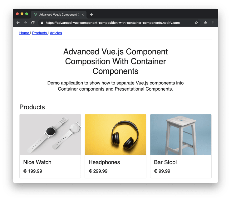
The ListingLayout component
The next component is a rather simple one. The ListingLayout component is responsible for the overall layout of our product and article listings.
<template>
  <div :class="$style.wrap">
    <div :class="$style.filter">
      <slot name="filter" />
    </div>
    <div :class="$style.grid">
      <slot name="grid" />
    </div>
    <div :class="$style.pagination">
      <slot name="pagination" />
    </div>
  </div>
</template>

<script>
export default {
  name: "ListingLayout",
};
</script>

<style lang="scss" module>
.grid {
  margin-top: 1.5em;
}

.pagination {
  margin-top: 1.5em;
}
</style>
Let’s take a look at how we can use this component to build a product listing view.
The ProductListingContainer component
The following example shows how powerful Container Components can be. The ProductListingContainer composes all the components needed to render our product listing view. Because this is a Container Component, we’re allowed to fetch data from an API and access the $route variable.
<template>
  <FrameApi
    v-slot="{ data: products, meta, methods: { query: fetchList } }"
    :endpoint="endpoint"
  >
    <FrameHooks
      @created="
        fetchList({
          filter: { category: $route.query.filter },
          page: $route.query.page,
        })
      "
      @route-query-change="
        fetchList({
          filter: { category: $event.filter },
          page: $event.page,
        })
      "
    >
      <ListingLayout>
        <NavFilter slot="filter" :filters="filters" />
        <ProductGrid slot="grid" :products="products" />
        <NavPagination
          slot="pagination"
          :route-query="$route.query"
          :page-count="meta ? meta.pageCount : 0"
        />
      </ListingLayout>
    </FrameHooks>
  </FrameApi>
</template>

<script>
import { get } from "../services/product";

import FrameApi from "./frames/FrameApi.vue";
import FrameHooks from "./frames/FrameHooks.vue";
import NavFilter from "./NavFilter.vue";
import NavPagination from "./NavPagination.vue";
import ProductGrid from "./ProductGrid.vue";
import ListingLayout from "./ListingLayout.vue";

export default {
  name: "ProductListingContainer",
  components: {
    FrameApi,
    FrameHooks,
    ListingLayout,
    NavFilter,
    NavPagination,
    ProductGrid,
  },
  created() {
    this.endpoint = (options) =>
      get({
        ...options,
        limit: 3,
      });
    this.filters = [
      {
        id: "all",
        name: "All",
      },
      {
        id: "electronics",
        name: "Electronics",
      },
      // ...
    ];
  },
};
</script>
There is a lot going on in our newly created Container Component. Let’s take a look at the most important parts. Again the FrameApi component is responsible for fetching data from our API. The FrameHooks component makes it possible to listen to the created and the route-query-change events. Initially after the component ist created and every time the route query changes, the fetchList() method, provided by the FrameApi component, is triggered and new products are fetched.
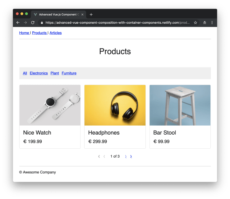
Now that our component is ready we can create a new PageProducts component and render the ProductListingContainer on it.
<template>
  <div :class="$style.wrap">
    <div :class="$style.intro">
      <h1 :class="$style.headline">Products</h1>
    </div>

    <div :class="$style.listing">
      <ProductListingContainer />
    </div>
  </div>
</template>

<script>
import ProductListingContainer from "../components/ProductListingContainer.vue";

export default {
  name: "PageProducts",
  components: {
    ProductListingContainer,
  },
};
</script>

<style lang="scss" module>
.intro {
  max-width: 32em;
  margin-right: auto;
  margin-left: auto;
  font-size: 1.25em;
  text-align: center;
}

.headline {
  margin-bottom: 0.5em;
  font-size: 1.75em;
  line-height: 1.2;
}

.listing {
  margin-top: 3em;
}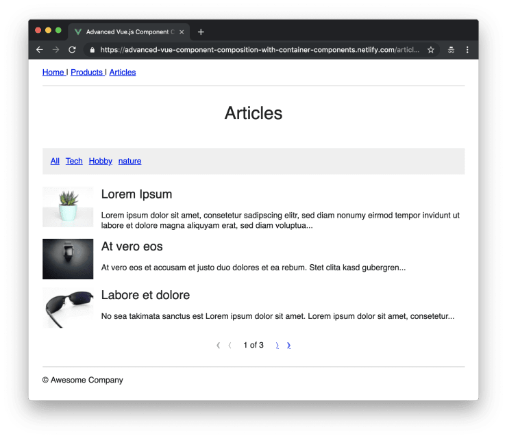
</style>Reusing components to build an article listing page
One of the huge benefits we get with splitting our applications up into a lot of smaller components is reusability. Let’s take a look at how we can use all the basic building blocks to quickly set up an article listing page. We need two additional components though: an ArticleSnippet component for rendering preview snippets of articles and an ArticleListingContainer component.
The ArticleSnippet component
Similar to the ProductCard there is not much to test with our new ArticleSnippet component.
// src/components/ArticleSnippet.spec.js
import { shallowMount } from "@vue/test-utils";

import ArticleSnippet from "./ArticleSnippet.vue";

describe("ArticleSnippet", () => {
  test("It should mount.", () => {
    const wrapper = shallowMount(ArticleSnippet, {
      propsData: {
        img: "foo.jpg",
        name: "Foo",
        text: "Lorem Ipsum",
      },
    });

    expect(wrapper.is("uimedia-stub")).toBe(true);
  });
});
Next you can see the code of the ArticleSnippet component.
<template>
  <UiMedia>
    <UiMediaFigure>
      <img :src="img" alt="" />
    </UiMediaFigure>
    <UiMediaBody>
      <h3 :class="$style.name">{{ name }}</h3>
      <p :class="$style.text">{{ text }}</p>
    </UiMediaBody>
  </UiMedia>
</template>

<script>
import { UiMedia, UiMediaBody, UiMediaFigure } from "./ui/UiMedia.vue";

export default {
  name: "ArticleSnippet",
  components: {
    UiMedia,
    UiMediaBody,
    UiMediaFigure,
  },
  props: {
    img: {
      required: true,
      type: String,
    },
    name: {
      required: true,
      type: String,
    },
    text: {
      required: true,
      type: String,
    },
  },
};
</script>

<style lang="scss" module>
.name {
  font-size: 1.5em;
}

.text {
  margin-top: 1em;
}
</style>
The ArticleListingContainer
For the next step we also need a new ArticleGrid component. You can find the code for the component on GitHub.
Now we have everything we need to build the ArticleListingContainer component. You might notice that it looks pretty similar to the ProductListingContainer. There might be the potential to create a single component which is able ro render both, articles and products, but for now a little bit of dublication is fine.
<template>
  <FrameApi
    v-slot="{ data: articles, meta, methods: { query: fetchList } }"
    :endpoint="endpoint"
  >
    <FrameHooks
      @created="
        fetchList({
          filter: { category: $route.query.filter },
          page: $route.query.page,
        })
      "
      @route-query-change="
        fetchList({
          filter: { category: $event.filter },
          page: $event.page,
        })
      "
    >
      <ListingLayout>
        <NavFilter slot="filter" :filters="filters" />
        <ArticleGrid slot="grid" :articles="articles" />
        <NavPagination
          slot="pagination"
          :route-query="$route.query"
          :page-count="meta ? meta.pageCount : 0"
        />
      </ListingLayout>
    </FrameHooks>
  </FrameApi>
</template>

<script>
import { get } from "../services/article";

import ArticleGrid from "./ArticleGrid.vue";
import FrameApi from "./frames/FrameApi.vue";
import FrameHooks from "./frames/FrameHooks.vue";
import NavFilter from "./NavFilter.vue";
import NavPagination from "./NavPagination.vue";
import ListingLayout from "./ListingLayout.vue";

export default {
  name: "ArticleListingContainer",
  components: {
    ArticleGrid,
    FrameApi,
    FrameHooks,
    ListingLayout,
    NavFilter,
    NavPagination,
  },
  created() {
    this.endpoint = (options) =>
      get({
        ...options,
        limit: 3,
      });
    this.filters = [
      {
        id: "all",
        name: "All",
      },
      {
        id: "tech",
        name: "Tech",
      },
      // ...
    ];
  },
};
</script>
After creating a new PageProducts and wiring everything up, we have successfully implemented our product listing page.
Wrapping it up
You might have noticed that none of our Presentational Components is dependent on any global state (like $router) or is communicating directly with an API. By making the Container Components responsible for dealing with such things we can keep our Presentational Components simple, highly reusable and easy to test.