Building a Website with Vue.js, the Storyblok Visual Editor and Netlify
- #javascript ,
- #vue ,
- #headless-cms ,
- #netlify
In some of my recent articles I wrote about how to build websites with a headless CMS backend and a Vue.js frontend. We explored the topic of pre-rendering with Vue.js and Nuxt.js. My headless CMS of choice for my last two articles was Storyblok, which is one of the most feature packed headless content management systems out there. But up until now I completely neglected one of the core features of Storyblok, which sets it apart from most competitors: the Visual Editor.
The final result of our work: an editable Vue.js powered website
Today we’ll build a Vue.js website which is easy to edit with the Storyblok Visual Editor, from start to finish. Apart from the Vue CLI and Storyblok, we’ll use my very own CSS framework avalanche (which didn’t get enough love from myself in recent months) and we’ll use Netlify for deploying our website to the world wide web.
You can see a live preview of the website we’ll build hosted on Netlify and you can view all the code on GitHub.
Getting started with the Vue CLI
The Vue CLI is a relatively new tool which helps you to set up a Vue.js project in no time.
# Install the Vue CLI globally.
npm install -g @vue/cli
# Initialize a new project.
vue create my-website
I recommend you to choose the following options during the Vue CLI setup process:
Please pick a preset:
> Manually select features
Check the features needed for your project:
> Babel
> Router
> CSS Pre-processors
> Linter / Formatter
Pick a CSS pre-processor:
> SCSS/SASS
# Answer the rest of the questions
# according to your preferences.
After the installation process has finished, we can start with customizing the default setup.
Customizing the Vue CLI default setup
First of all, we can delete everything we don’t need. We can remove the src/assets directory and also the HelloWorld.vue component in src/components.
App component
We’ll use the src/App.vue component to provide the basic layout for our application. Let’s update the default App.vue file generated by the Vue CLI so it fits our needs.
<template>
<div id="app" :class="$options.name">
<header :class="`${$options.name}__header`">
<router-link :class="`${$options.name}__logo`" to="/">
Fancy Company
</router-link>
<nav :class="`${$options.name}__nav`">
<router-link :class="`${$options.name}__navLink`" to="/">
Home
</router-link>
|
<router-link :class="`${$options.name}__navLink`" to="/about">
About
</router-link>
</nav>
</header>
<router-view :class="`${$options.name}__main`" />
<footer :class="`${$options.name}__footer`">© Fancy Company</footer>
</div>
</template>
<script>
export default {
name: "App",
};
</script>We completely replace the default code provided by the Vue CLI with our own custom HTML structure. In the <template> section you can see a little trick I like to use in my components: I follow the BEM naming convention and I use the name of the component ($options.name) as the block part of all the CSS classes. This results in the following HTML output.
<div id="app" class="App">
  <header class="App__header">
    <!-- ... -->
  </header>

  <!-- ... -->

  <footer class="App__footer">
    <!-- ... -->
  </footer>
</div>
This makes it very easy to recognize specific components in the final output during debugging sessions.
Router configuration
The default router configuration comes with some (in my opinion) strange defaults, so we also have to make some updates to the src/router.js file.
 import Router from 'vue-router';
 import Vue from 'vue';

-import About from './views/About.vue';
+const About = () => import('./views/About.vue');
-import Home from './views/Home.vue';
+const Home = () => import('./views/Home.vue');

 Vue.use(Router);

 export default new Router({
+  mode: 'history',
   routes: [
     {
       path: '/',
Above you can see that we use the dynamic import syntax instead of the default import x from 'y' syntax. This has the benefit of triggering webpack to apply its code splitting logic to our routes, which leads to a smaller entry bundle and faster loading times.
Additionally we configure the Router to use the history mode. This enables pretty URLs (/about instead of /#/about). Keep in mind, though, that not every browser supports the history JavaScript API but in my opinion, the support is good enough.
View components
Next we make some modifications to the default view components the Vue CLI created for us.
 <template>
-  <div class="about">
+  <div :class="$options.name">
     <h1>This is an about page</h1>
   </div>
 </template>
+
+<script>
+export default {
+  name: 'About',
+};
+</script>
Above you can see the changes made to the src/views/About.vue component. For now we keep it as simple as possible, so we can later start building our application from scratch.
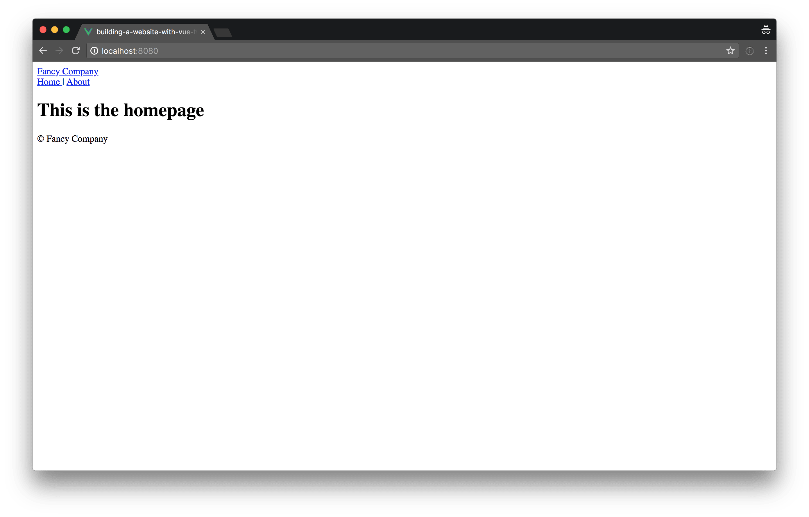
 <template>
-  <div class="home">
-    <img src="../assets/logo.png">
-    <HelloWorld msg="Welcome to Your Vue.js App"/>
+  <div :class="$options.name">
+    <h1>This is the homepage</h1>
   </div>
 </template>

 <script>
-// @ is an alias to /src
-import HelloWorld from '../components/HelloWorld.vue';
-
 export default {
-  name: 'home',
-  components: {
-    HelloWorld,
-  },
+  name: 'Home',
 };
 </script>
We also clean up the src/views/Home.vue component to only output a headline for now.
Setting up the basic CSS structure
Now that we’ve removed everything we don’t need, we can start on a plan level and add all the functionality we do need step by step. Let’s begin with setting up a basic custom CSS framework powered by my own framework named avalanche.
CSS reset and base styles
Applying a CSS reset which, well, resets all of the default styles certain browsers apply, is somewhat of a controversial topic. Many people argue that using a less disruptive approach like Normalize.css provides betters results. Personally, I use both: if I want to build a website exactly the way I myself or a designer imagines it, I use a reset. If I have some wiggle room and I just want to get something out there, more often than not I reach for Normalize.css.
npm install @avalanche/generic-box-sizing-reset reset-css --saveIn our case, though, we want to have full control over the styling of the website, so we install two dependencies which help us applying basic resets to the CSS of our website. The first one is the @avalanche/generic-box-sizing-reset which changes the default box-sizing from content-box to border-box. If you’re interested in the benefits of this practice, you can read this article by Paul Irish which goes into all the details.
The reset-css package includes the famous CSS reset written by Eric Meyer.
// src/assets/scss/generic/_base.scss
@import "~@avalanche/generic-box-sizing-reset";
@import "~reset-css/sass/reset";

// 1. Usually a larger line height is beneficial
//    for blocks of text, but we want to have a
//    rather small line height for our basic UI
//    elements so we can apply uniform spacings
//    using margins and paddings. We'll add an
//    extra CSS class with a larger line height
//    to apply to blocks of text.
// 2. A kind of “dirty” white is more pleasing
//    to the eyes.
// 3. A kind of “almost black but not quite black”
//    is also more pleasing to the eyes.
body {
  line-height: 1.25; // 1
  background-color: #f9f9f9; // 2
  color: #222; // 3
  font-family: sans-serif;
}

// 1. Larger font sizes need less line height.
h1,
h2,
h3,
h4,
h5 {
  line-height: 1.2; // 1
  font-weight: 700;
}

h1 {
  font-size: 2.027em;
}

h2 {
  font-size: 1.802em;
}

h3 {
  font-size: 1.602em;
}

h4 {
  font-size: 1.424em;
}

h5 {
  font-size: 1.266em;
}

h6 {
  font-size: 1.125em;
}

// 1. Make images adapt to the available
//    space (responsive images).
// 2. Remove the tiny space at the bottom
//    of images.
img {
  max-width: 100%; // 1
  max-height: 100%; // 1
  width: auto; // 1
  height: auto; // 1
  vertical-align: middle; // 2
}
We create a new _base.scss file in the newly created src/assets/scss/generic directory, in which we can import the two dependencies we’ve installed previously. Additionally, we add some basic default styles.

Basic layout
As you can see in the screenshot above, our application is still quite lacking in the looks department. Let’s change this by applying a few basic styles to make it, at least somewhat, appear like a decent looking website.
Because we want to use avalanche packages whenever possible, instead of writing our own CSS and because we want to only load the parts of those avalanche packages we actually need, we have to install another npm package: node-sass-magic-import (which is also a project of mine).
npm install node-sass-magic-importer --saveAfter installing the package, we must update our vue.config.js file to make use of it during the build process (make sure to restart the serve command if you’ve started it before).
+const nodeSassMagicImporter = require('node-sass-magic-importer');
+
 module.exports = {
   lintOnSave: false,
+  css: {
+    loaderOptions: {
+      sass: {
+        importer: nodeSassMagicImporter(),
+      },
+    },
+  },
 };
Now let’s install the @avalanche/object-container package to help us adding a container around the content of our little website.
npm install @avalanche/object-container --saveThanks to the node-sass-magic-importer we’re now able to use a special import syntax, to import only the CSS classes we need from certain files.
 <style lang="scss">
 @import './assets/scss/generic/base';
+@import '{ .o-container } from ~@avalanche/object-container';
 </style>
<div
id="app"
- :class="$options.name"
+ :class="[$options.name, 'o-container']"
>
<header :class="`${$options.name}__header`">
<router-linkIn the code snippets above, you can see the changes made to the src/App.vue file. We apply the o-container class imported in the <style> section from the @avalanche/object-container package to the root element of the component. Now the width of our website is limited and it’s horizontally centered.
The header
Next we need to give some love to the header of the website.
npm install @avalanche/setting-colors @avalanche/setting-spacings --saveBecause we want our application to have consistent colors and spacings, we want to use variables for those. Again the avalanche framework got us covered, we use the @avalanche/setting-colors package which provides us with a basic setup for color variable management and @avalanche/setting-spacings includes a set of spacing variables.
// src/assets/scss/settings/_colors.scss
@import "~@avalanche/setting-colors";

$colors: (
  a: #2196f3,
  b: #2364aa,
  c: #73bfb8,
  d: #fec601,
  e: #ea7317,
  text: #222,
);
Because we want to override certain variables, or add new ones if we need to, we create a new _colors.scss file in the src/assets/scss/settings directory in which we import the @avalanche/setting-colors package and override the default $colors variable with our own set of colors, including a separate variable for the black-ish text color we’ve used earlier. We can use the new text color variable in our src/assets/scss/generic/_base.scss file by making the following changes.
+@import '../settings/colors';
 @import '~@avalanche/generic-box-sizing-reset';
 @import '~reset-css/sass/reset';

 body {
   line-height: 1.25; // 1
   background-color: #f9f9f9; // 2
-  color: #222; // 3
+  color: setting-color(text); // 3
   font-family: sans-serif;
 }
Note that we use a setting-color() helper function for retrieving the color, this is because otherwise it’s quite cumbersome to get values from Sass maps.
Next up we do the same for our spacing variables, but this time we rely on the default settings provided by the avalanche package.
// src/assets/scss/settings/_spacings.scss
@import "~@avalanche/setting-spacings";
Now we’re ready to add some basic styling to the header of our website.
 <style lang="scss">
+@import './assets/scss/settings/colors';
+@import './assets/scss/settings/spacings';
 @import './assets/scss/generic/base';
 @import '{ .o-container } from ~@avalanche/object-container';
+
+.App {
+  &__header {
+    display: flex;
+    padding-top: setting-spacing(m);
+    padding-bottom: setting-spacing(m);
+    justify-content: space-between;
+    border-bottom: 1px solid setting-color(b, gray);
+  }
+
+  &__logo,
+  &__navLink {
+    color: setting-color(text);
+    text-decoration: none;
+
+    &:hover,
+    &:focus {
+      text-decoration: underline;
+    }
+  }
+}
 </style>
Main content and footer
Now that we’ve already set up most of our basic CSS and we’ve declared all the variables we need, moving forward gets easier. Next up you can see the changes necessary to the src/App.vue component in order to add some very basic styling for the main content area and the footer of our website.
     }
   }
+
+  &__main {
+    padding-top: setting-spacing(xxl);
+    padding-bottom: setting-spacing(xxl);
+  }
+
+  &__footer {
+    padding-top: setting-spacing(m);
+    padding-bottom: setting-spacing(m);
+    border-top: 1px solid setting-color(b, gray);
+  }
 }
 </style>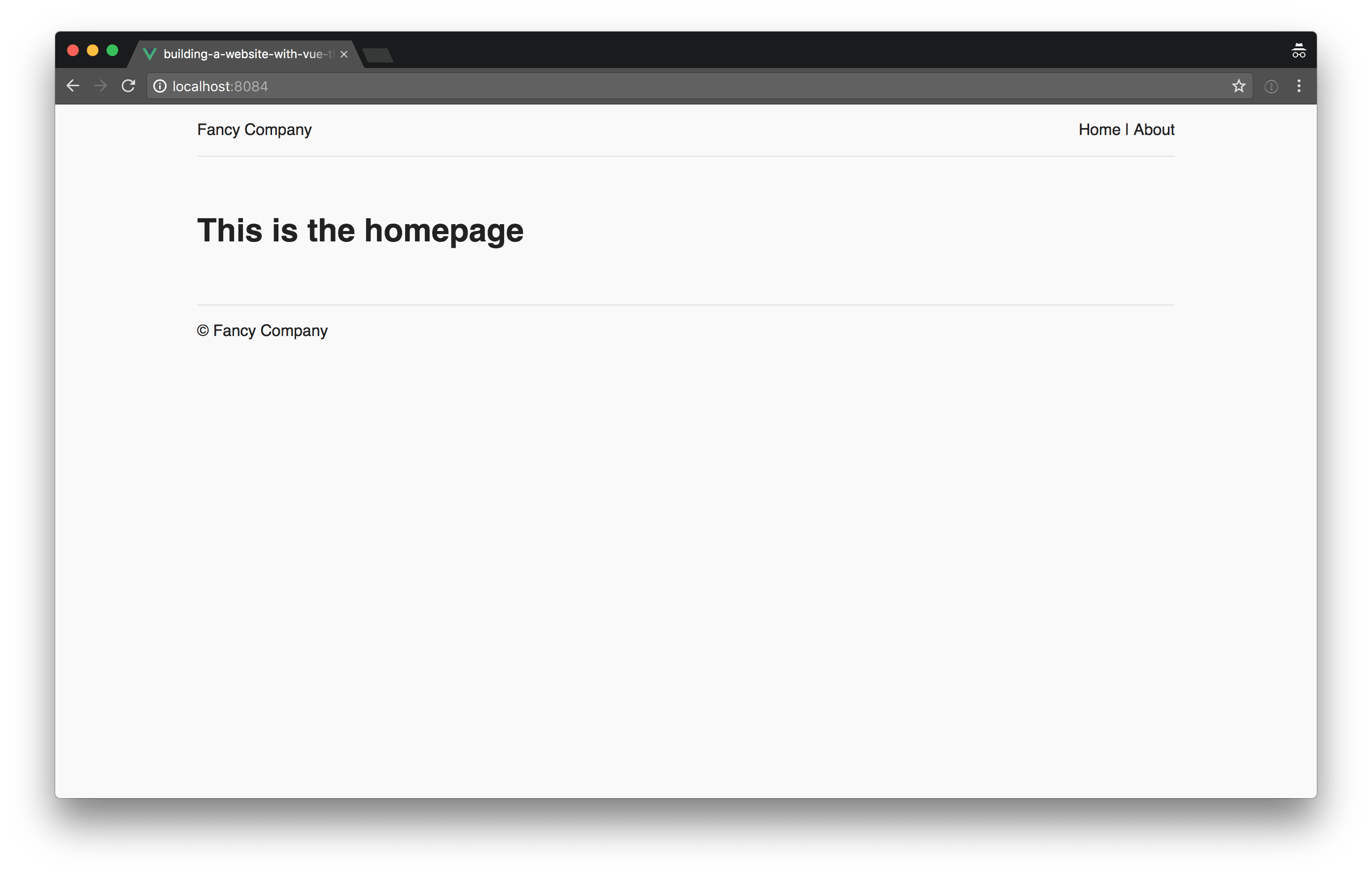
In the screenshot above, you can see the current state of affairs. Of course, this is not exactly an award winning design but I hope you get the basic idea.
Do you want to learn more about advanced Vue.js techniques?
Register for the Newsletter of my upcoming book: Advanced Vue.js Application Architecture.
Creating content in Storyblok
I have to admit, setting up the basic application and CSS structure, is not the most interesting thing to do but now it gets more exciting, I promise.
In order to being able to display content in our application, we have to create some content in Storyblok first. So let’s start with adding a new Storyblok component.
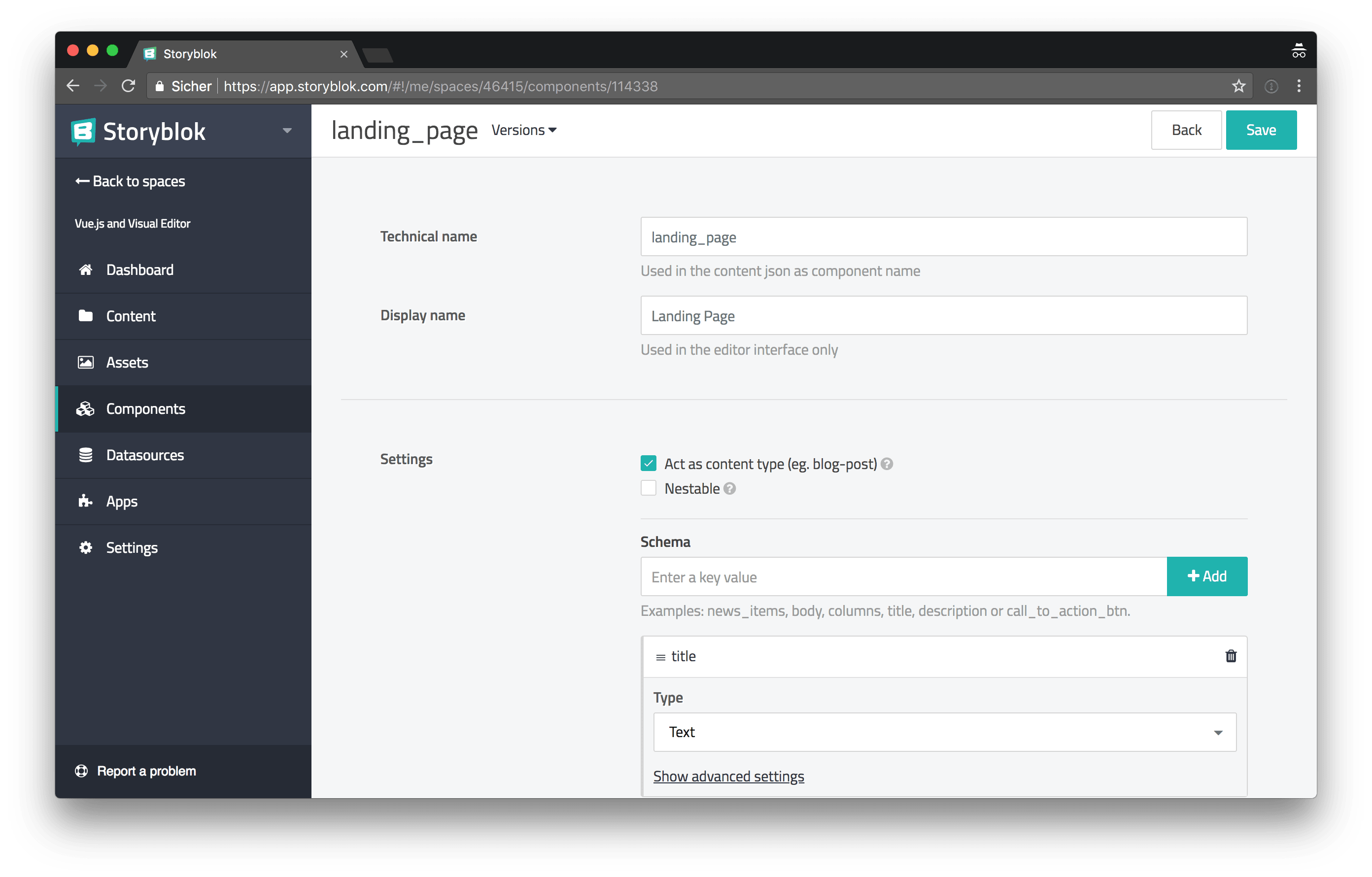
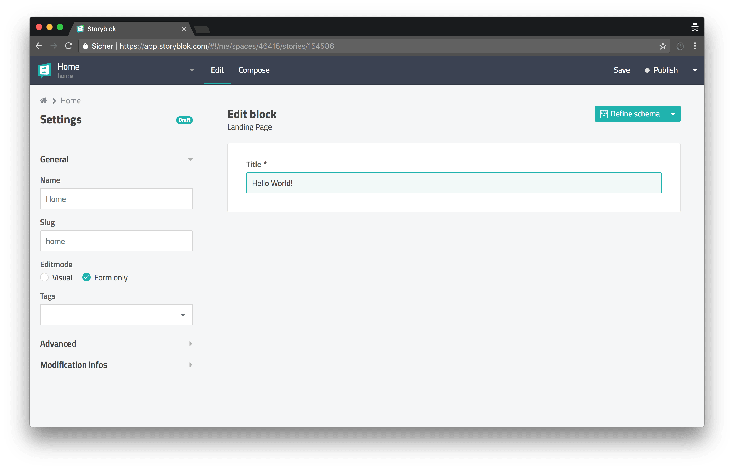
For the beginning we just add one schema for the page title, this is only temporarily, we’ll replace this later with something more sophisticated. Next we can create a new Landing Page content.
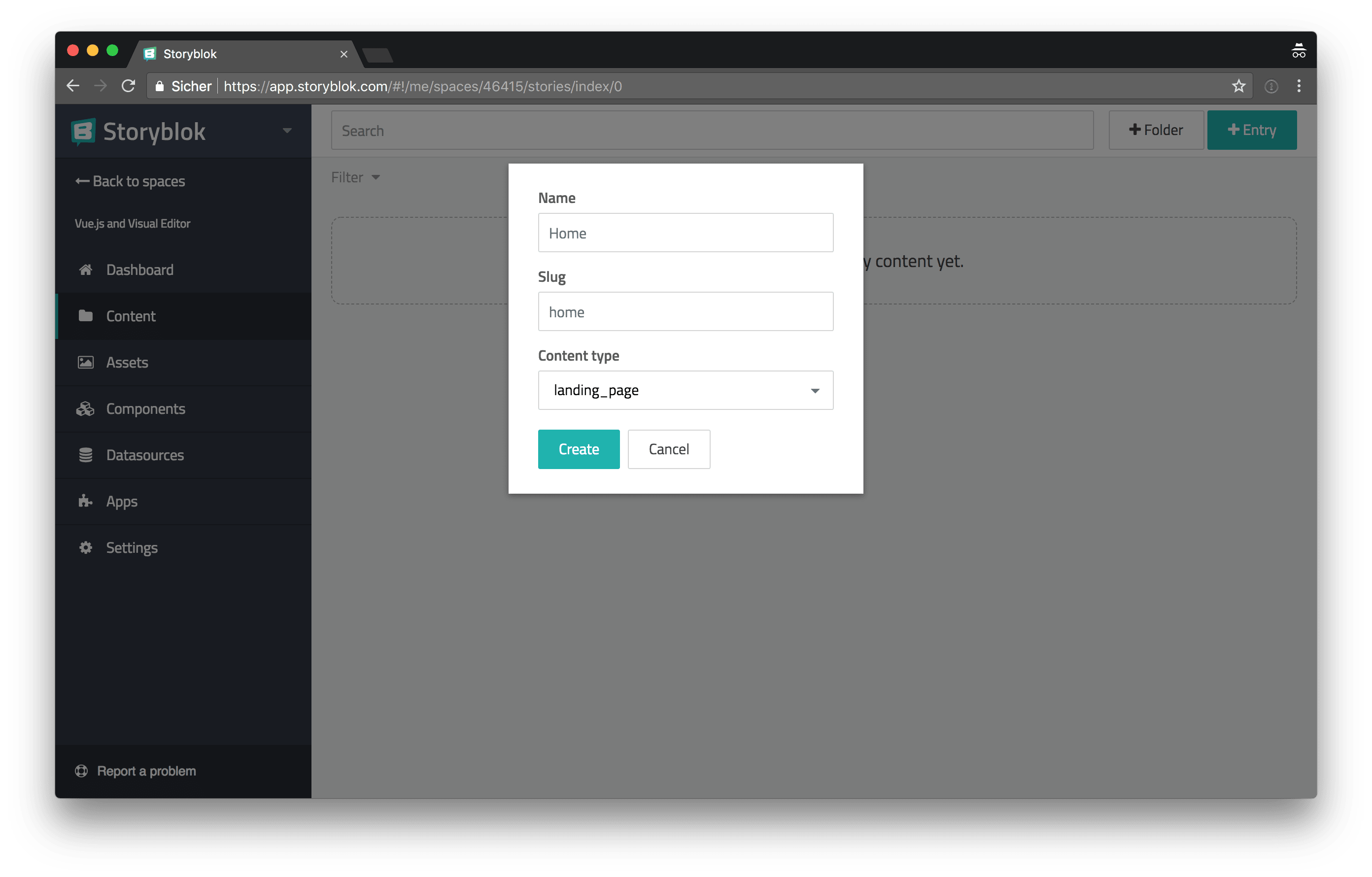
After adding a new Landing Page content we can set the value of the title field we’ve added previously.
Integrating Storyblok in Vue.js
We’ve created our first content in Storyblok, let’s integrate Storyblok into Vue.js and set it up to let us edit the website with the Visual Editor.
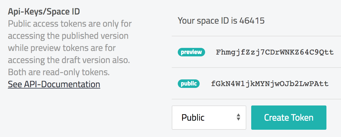
First of all, we have to add the Storyblok access tokens, which we need to talk to the Storyblok API, to our environment variables.
 const nodeSassMagicImporter = require('node-sass-magic-importer');

+const PREVIEW_TOKEN = 'FhmgjfZzj7CDrWNKZ64C9Qtt';
+const PUBLIC_TOKEN = 'fGkN4W1jkMYNjwOJb2LwPAtt';

+process.env.VUE_APP_ACCESS_TOKEN = process.env.STORYBLOK_BRIDGE ? PREVIEW_TOKEN : PUBLIC_TOKEN;
+process.env.VUE_APP_STORYBLOK_BRIDGE = process.env.STORYBLOK_BRIDGE;

 module.exports = {
   lintOnSave: false,
   css: {
Above you can see the updated vue.config.js file. If the STORYBLOK_BRIDGE environment variable is set, a different token is used. We later need to use the PREVIEW_TOKEN for the Visual Editor to work. The Storyblok Bridge is a bridge between our application and the Storyblok Visual Editor, we’ll later use the STORYBLOK_BRIDGE environment variable to control if the Storyblok Bridge script should be loaded or not.
npm install storyblok-js-client --saveThe storyblok-js-client package provides all the functionality we need to talk to the Storyblok API.
import StoryblokClient from "storyblok-js-client";

const api = new StoryblokClient({
  accessToken: process.env.VUE_APP_ACCESS_TOKEN,
  cache: {
    clear: "auto",
    type: "memory",
  },
});

// If the Storyblok Bridge is enabled we
// override the `api.get()` method to always
// fetch the `draft` version from the API, we
// need this functionality for the Visual Editor.
if (process.env.VUE_APP_STORYBLOK_BRIDGE === "true") {
  api.get = function get(slug, params) {
    return StoryblokClient.prototype.get.call(this, slug, {
      ...params,
      version: "draft",
    });
  };
}

export default api;
Fetching data from Storyblok
Now that everything we need to talk to the Storyblok API is set up, let’s update our Home view component to fetch the content we’ve created earlier.
 <template>
-  <div :class="$options.name">
+  <div
+    v-if="content"
+    :class="$options.name"
+  >
-    <h1>This is the homepage</h1>
+    <h1>{{ content.title }}</h1>
   </div>
 </template>

 <script>
+import api from '../utils/api';
+
 export default {
   name: 'Home',
+  data() {
+    return {
+      content: null,
+    };
+  },
+  created() {
+    this.fetchData();
+  },
+  methods: {
+    async fetchData() {
+      const { data } = await api.get('cdn/stories/home');
+      this.content = data.story.content;
+    },
+  },
 };
 </script>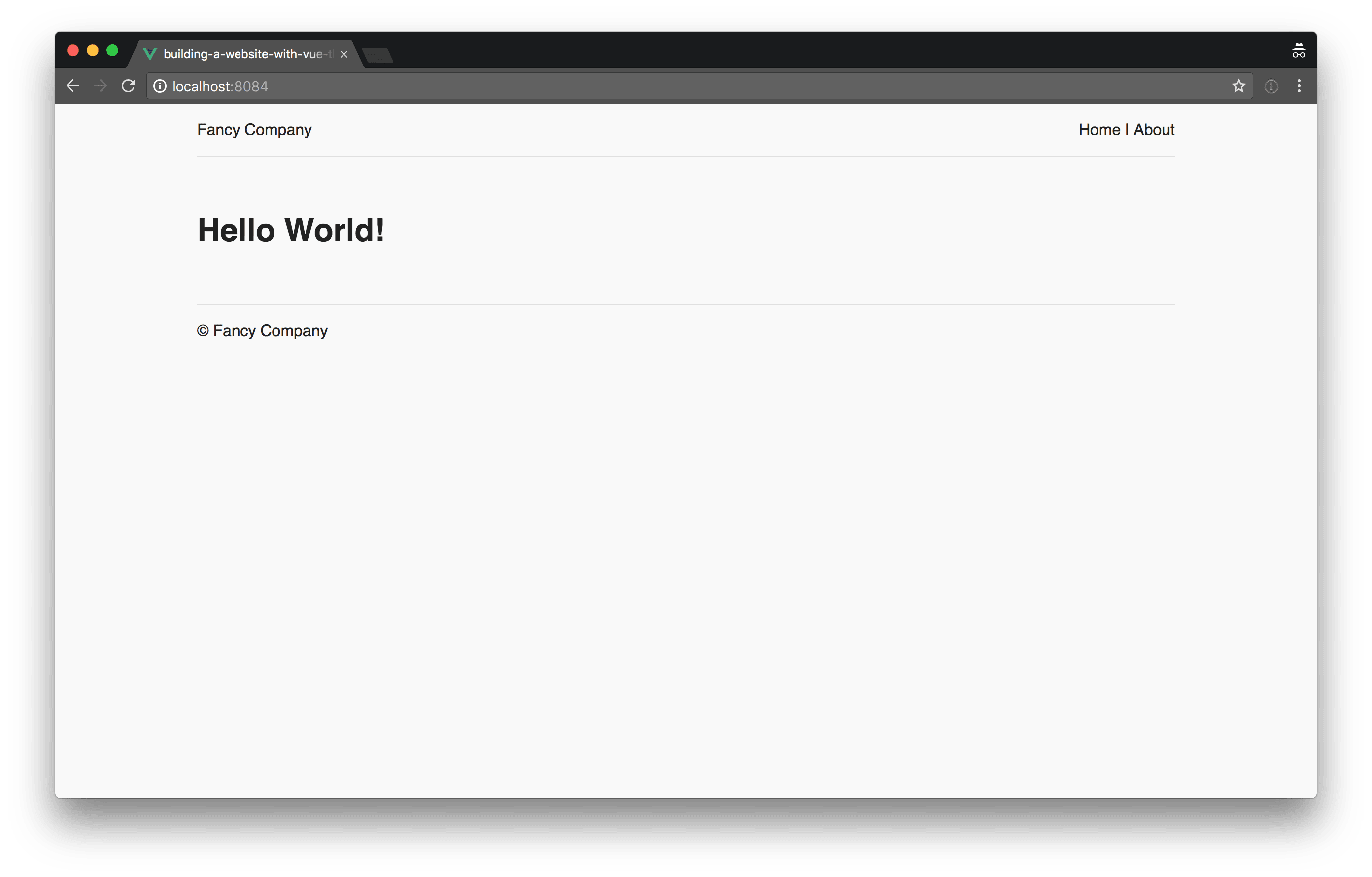
Enabling the Visual Editor
We’re now able to fetch content via the Storyblok API, let’s take it one step further and integrate the Visual Editor into our little application.
Loading the Storyblok Bridge
For the Visual Editor to work, we must load the Storyblok Bridge script. We can do this by modifying our base public/index.html template.
     <link rel="icon" href="<%= BASE_URL %>favicon.ico">
     <title>building-a-website-with-vue-the-storyblok-visual-editor-and-netlify</title>
+    <% if (VUE_APP_STORYBLOK_BRIDGE === 'true') { %>
+      <script src="//app.storyblok.com/f/storyblok-latest.js?t=<%= VUE_APP_ACCESS_TOKEN %>" type="text/javascript"></script>
+    <% } %>
   </head>
   <body>
As you can see above, we conditionally inject the Storyblok Bridge script into the template if the VUE_APP_STORYBLOK_BRIDGE environment variable is set.
One final thing we have to do, is to install the storyblok-vue plugin and integrate it into our application.
npm install storyblok-vue --save+import StoryblokVue from 'storyblok-vue';
import Vue from 'vue';
import App from './App.vue';
import router from './router';
+Vue.use(StoryblokVue);After installing the storyblok-vue package and adding it to the src/main.js entry file, we’re now able to use the v-editable directive in our templates to mark certain parts of the application as editable by the Visual Editor.
 <template>
   <div
+    v-editable="content"
     v-if="content"
     :class="$options.name"
   >
     <h1>{{ content.title }}</h1>
By adding the v-editable and passing it the content object as its value, we letting the Visual Editor know that this element is editable and what its content is.
   created() {
     this.fetchData();
+
+    if (this.$storyblok) {
+      this.$storyblok.init();
+
+      // Reload the browser if the content
+      // is saved or published in the editor.
+      this.$storyblok.on(['change', 'published'], () => window.location.reload());
+
+      // Live update the content
+      // in the Visual Editor.
+      this.$storyblok.on('input', ({ story }) => {
+        this.content = story.content;
+      });
+    }
   },
In the created() hook of the Home view component, we check if the Storyblok Bridge is active. If it is active we call the init() method and listen for events on the $storyblok object to trigger either a reload, if the content is changed or published, or we update the content if an input event is triggered by the editor.
Next we add two new npm scripts to the package.json file to easily build our application with bridge mode enabled for the Visual Editor to work correctly.
   "scripts": {
     "serve": "vue-cli-service serve",
+    "serve-with-sb-bridge": "STORYBLOK_BRIDGE=true vue-cli-service serve",
     "build": "vue-cli-service build",
+    "build-with-sb-bridge": "STORYBLOK_BRIDGE=true npm run build",
Let’s run our application in bridge mode by typing npm run serve-with-sb-bridge into your command line of choice.
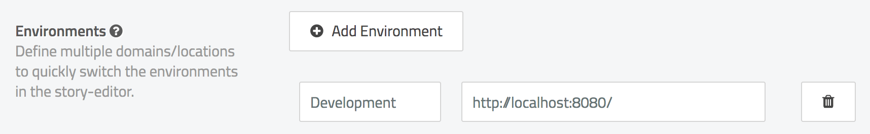
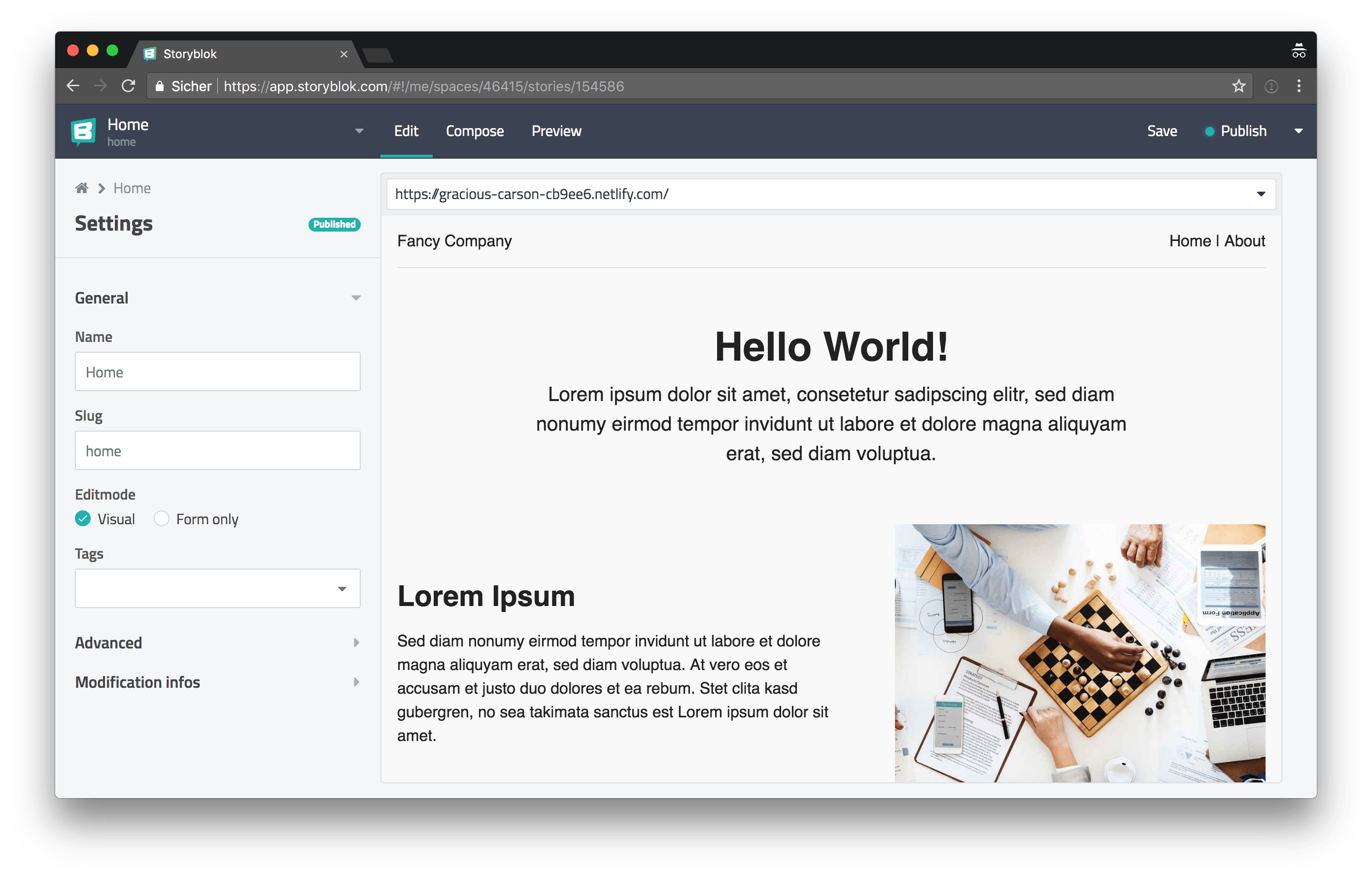
If we now head over to Storyblok, we first have to add a new environment for our development setup.
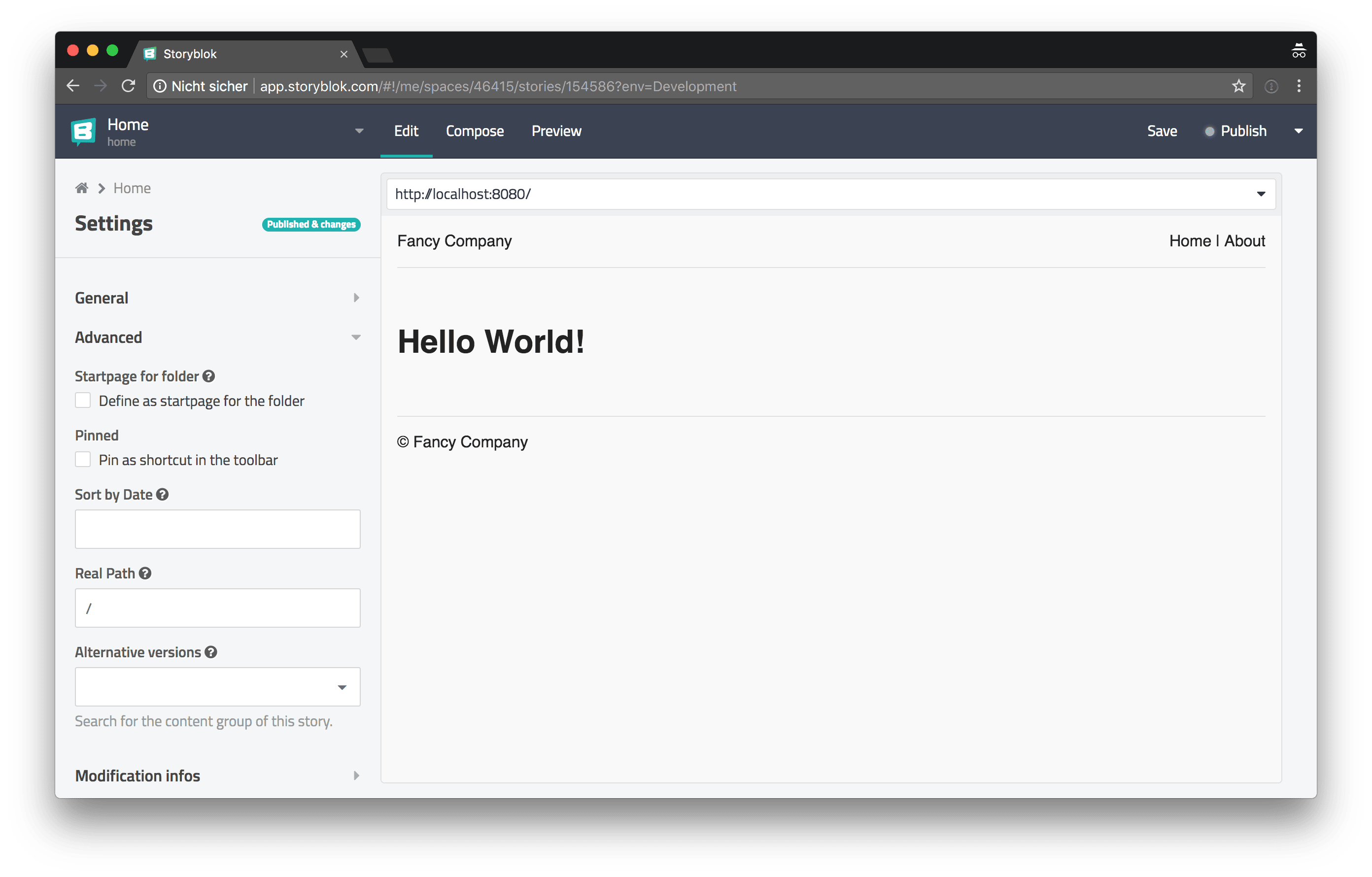
Next we open the Home content we’ve created earlier and we change its Real Path setting in the Advanced section in the left sidebar, so the path is /. Now we can change the Editmode in the General section in the left sidebar to Visual and in the address bar on the right we can choose our development environment we’ve set up earlier.
In the following video you can see the Visual Editor in action.
The Visual Editor in action
Story time
Now that the basic project setup is ready and we’ve successfully integrated the Storyblok Visual Editor, it’s time to make our website a little bit more interesting by adding some more content.
We want to build a system where pages like our Home landing page, consist of multiple components. For this purpose we add two new components in Storyblok: an Intro component and a Media Object component. To stick to the “Story” naming scheme we’ll prefix components, which are used as smaller parts of a Story, with chapter.

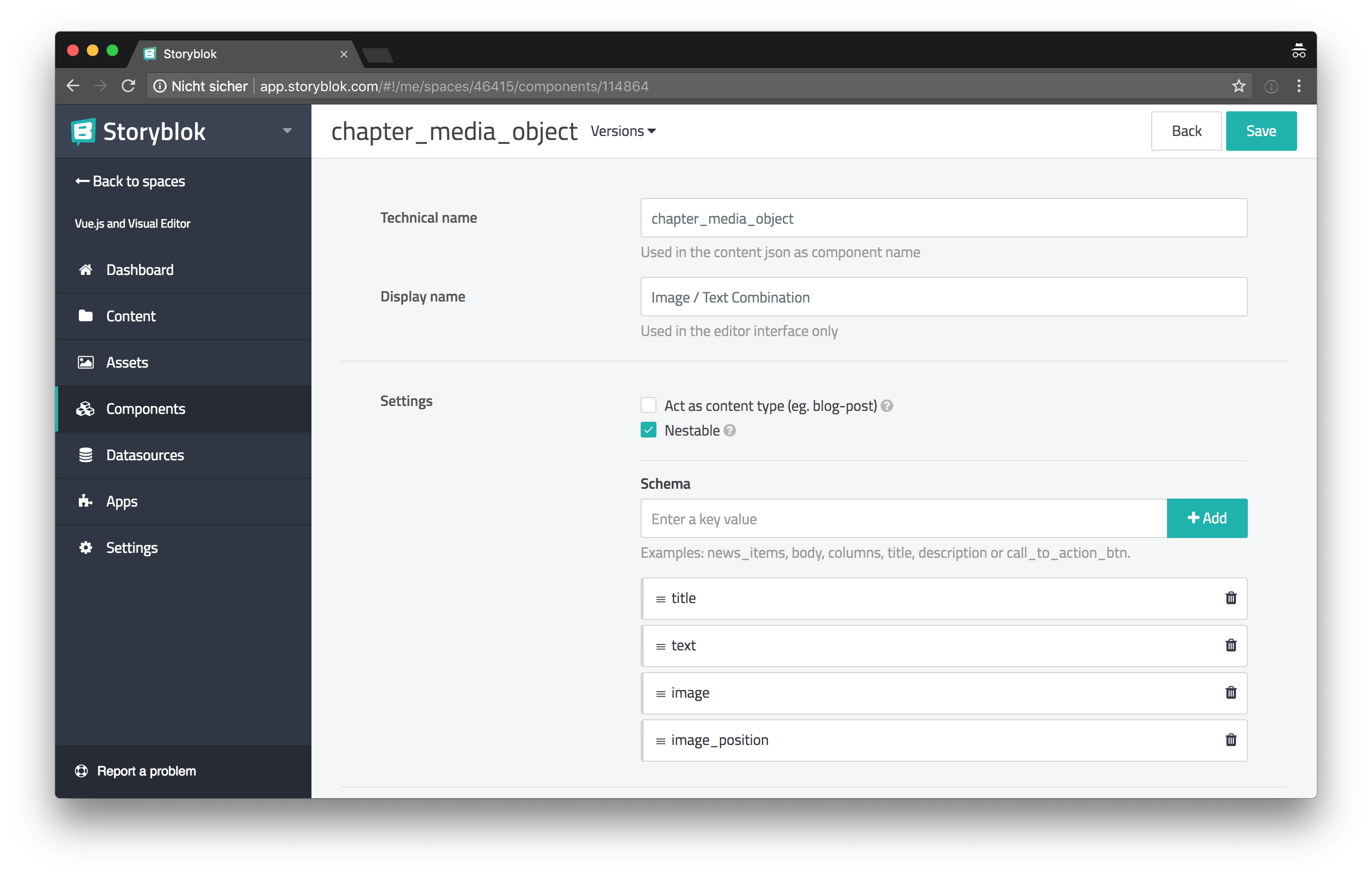
After creating the two new components, we have to update our Landing Page component to make it possible to add the new chapter blocks. We remove the title schema and add a new chapters schema of type Blocks.

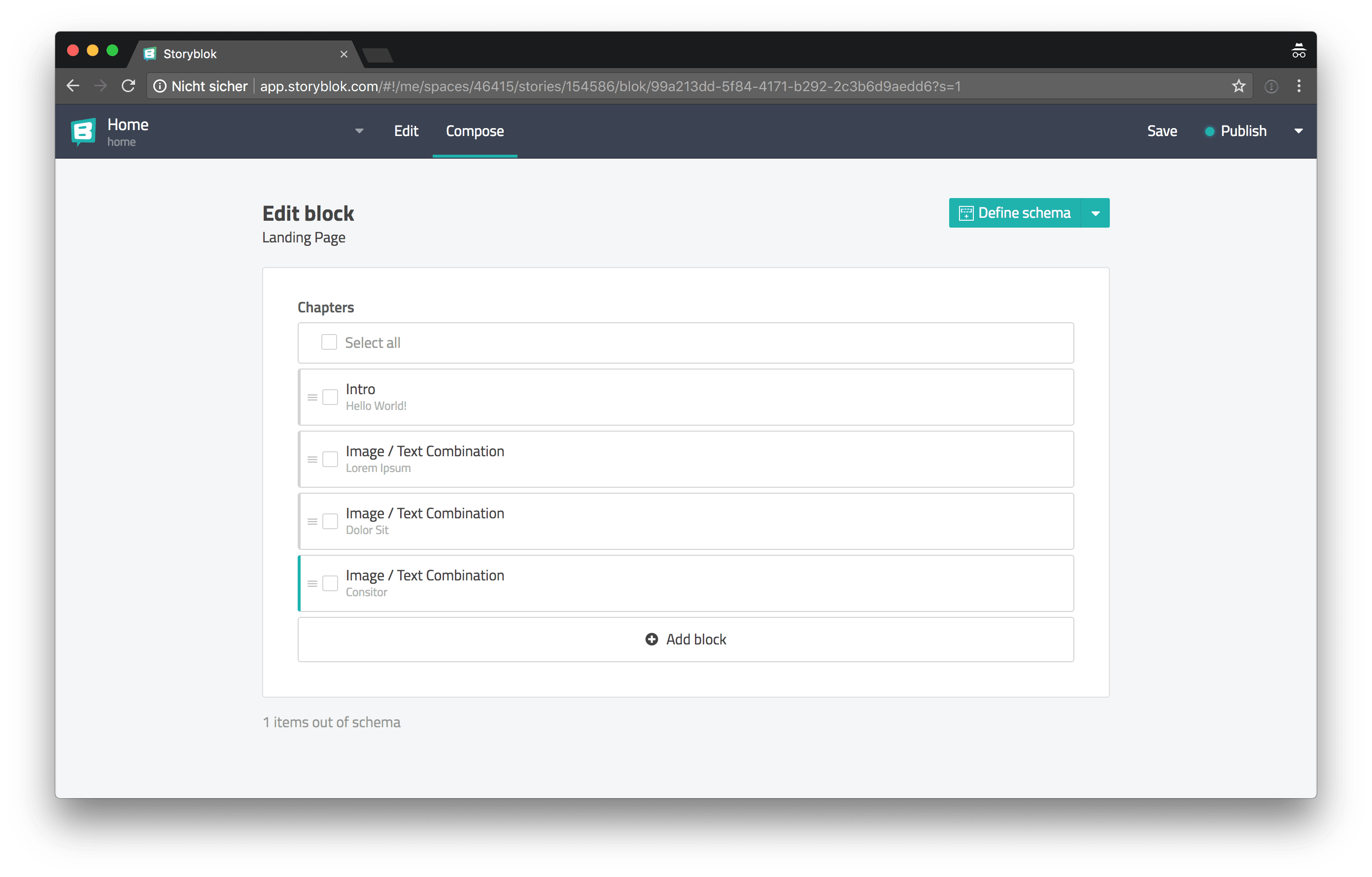
Finally we have to update our Landing Page content to make use of the newly created chapters schema. So let’s add an Intro chapter and some Media Object chapters.
Blok components
Now that we’ve updated our content, we also have to make some adjustments to our application and we have to add a few new components to render the newly written chapters of our story.
The Intro component
Let’s start with the most straightforward chapter component first: the Intro component.
Because we’re using a Markdown text field in our intro schema, we need a Markdown parser to render the content. marked is one of the better JavaScript Markdown parsers out there.
npm install marked --saveIn the following code snippet, you can see the src/components/ChapterIntro.vue component.
<template>
  <div v-editable="blok" :class="$options.name">
    <h1>{{ blok.title }}</h1>
    <div :class="['o-content', `${$options.name}__body`]" v-html="text" />
  </div>
</template>

<script>
import marked from "marked";

export default {
  name: "ChapterIntro",
  props: {
    blok: {
      type: Object,
      required: true,
    },
  },
  computed: {
    text() {
      return marked(this.blok.text);
    },
  },
};
</script>

<style lang="scss">
@import "../assets/scss/settings/spacings";

.ChapterIntro {
  margin-right: auto;
  margin-left: auto;
  max-width: 32em;
  text-align: center;
  font-size: 1.25em;

  &__body {
    margin-top: setting-spacing(xs);
  }
}
</style>
You can see that we’re using a computed property to transform the raw Markdown to HTML. In the template you can see a new CSS class o-content we use this class to add spacings between text elements like <p> and to apply a bigger line height.
// src/assets/scss/objects/_content.scss
@import "../settings/spacings";

// 1. The lobotomized owl selector targets
//    every element which is an adjacent sibling
//    of another element. It basically works the
//    same as `:not(:first-child)` but with
//    lower specificity.
//    See: https://alistapart.com/article/axiomatic-css-and-lobotomized-owls
.o-content {
  line-height: 1.5;

  * + * {
    // 1
    margin-top: setting-spacing(m);
  }

  strong {
    font-weight: 700;
  }
}
We import this new SCSS file in the src/App.vue component to make it globally available.
 @import '{ .o-container } from ~@avalanche/object-container';
+@import './assets/scss/objects/content';

 .App {
   &__header {
The Media Object component
In the following code block you can see the code of the Media Object component.
<template>
  <div v-editable="blok" :class="$options.name">
    <div
      :class="{
        [`${$options.name}__layout`]: true,
        [`${$options.name}__layout--reverse`]: blok.image_position === 'left',
      }"
    >
      <div :class="['o-content', `${$options.name}__body`]">
        <h2>{{ blok.title }}</h2>
        <div v-html="text" />
      </div>
      <div :class="`${$options.name}__figure`">
        <img
          :src="$img(blok.image, 450, 340)"
          :srcset="`${$img(blok.image, 900, 680, { quality: 40 })} 2x`"
          alt=""
        />
      </div>
    </div>
  </div>
</template>

<script>
import marked from "marked";

export default {
  name: "ChapterMediaObject",
  props: {
    blok: {
      type: Object,
      required: true,
    },
  },
  computed: {
    text() {
      return marked(this.blok.text);
    },
  },
};
</script>

<style lang="scss">
@import "../assets/scss/settings/spacings";

.ChapterMediaObject {
  $image-size: 450px;

  overflow: hidden;

  &__layout {
    display: flex;
    margin-top: -(setting-spacing(m));
    margin-left: -(setting-spacing(xxl));
    flex-wrap: wrap;

    > * {
      padding-top: setting-spacing(m);
      padding-left: setting-spacing(xxl);
    }

    align-items: center;

    &--reverse {
      flex-direction: row-reverse;
    }
  }

  &__body {
    flex-basis: 24em;
    flex-grow: 1;
  }

  &__figure {
    margin-right: auto;
    max-width: $image-size;
    flex-basis: 16em;
    flex-grow: 1;
    box-sizing: content-box;
  }
}
</style>
In the <template> section of the component, you can see the $img helper function. We use this function to make it a little easier for us to create the correct URLs for certain variants of an image we want to load from Storyblok.
// src/plugins/img.js
import Vue from "vue";

const defaultFilters = {
  quality: 80,
};

export default {
  install() {
    Vue.prototype.$img = function $img(
      src = "",
      width = 0,
      height = 0,
      filters = {},
    ) {
      const parts = ["img2.storyblok.com"];

      if (height > 0 || width > 0) {
        parts.push(`${width}x${height}`);
      }

      const filtersWithDefaults = { ...defaultFilters, ...filters };
      const filterNames = Object.keys(filtersWithDefaults);

      parts.push(
        `filters:${filterNames
          .map((name) => `${name}(${filtersWithDefaults[name]})`)
          .join(":")}`,
      );

      return src.replace("a.storyblok.com", parts.join("/"));
    };
  },
};
The $img function added to the Vue prototype, helps us with applying certain filters to our images. Also, we set a default image quality of 80.
Because this is a Vue plugin, we have to register it in our entry file src/main.js.
 import App from './App.vue';
+import Img from './plugins/img';
 import router from './router';

+Vue.use(Img);
 Vue.use(StoryblokVue);
The Landing Page component
Now that we’ve built all the components we need to render the chapters we’ve created in Storyblok, we can build a new generic src/components/StoryLandingPage.vue component to render those chapters for us.
We’ll use another avalanche helper class o-vertical-spacing in the landing page component, so let’s install it first and add it to the src/App.vue base component.
npm install @avalanche/object-vertical-spacing --save @import '{ .o-container } from ~@avalanche/object-container';
+@import '{ .o-vertical-spacing, .o-vertical-spacing--xxl } from ~@avalanche/object-vertical-spacing';
@import './assets/scss/objects/content';
.App {Now we’re ready to build the src/components/StoryLandingPage.vue component, beneath you can see its implementation.
<template>
  <div
    :class="[$options.name, 'o-vertical-spacing', 'o-vertical-spacing--xxl']"
  >
    <component
      v-for="chapter in content.chapters"
      :key="chapter._uid"
      :blok="chapter"
      :is="`${chapter.component.replace(/_/g, '-')}`"
    />
  </div>
</template>

<script>
import ChapterIntro from "./ChapterIntro.vue";
import ChapterMediaObject from "./ChapterMediaObject.vue";

export default {
  name: "StoryLandingPage",
  components: {
    ChapterIntro,
    ChapterMediaObject,
  },
  props: {
    content: {
      required: true,
      type: Object,
    },
  },
};
</script>
The o-vertical-spacing and o-vertical-spacing--xxl classes, which we apply to the root element, make sure that every direct child of this element (except the first child) has some space applied to the top of it.
We use a dynamic <component> to render the corresponding component for the chapter we get from the Storyblok API. Keep in mind, though, that you have to register all the possible components, which might be retrieved from Storyblok, before you can render them with the help of the dynamic component.
Next we can add our newly created landing page component to the Home and About view components.
 <template>
-  <div
-    v-editable="content"
-    v-if="content"
-    :class="$options.name"
-  >
-    <h1>{{ content.title }}</h1>
+  <div :class="$options.name">
+    <story-landing-page
+      v-if="content"
+      :content="content"
+    />
   </div>
 </template>

 <script>
-import api from '../utils/api';
+import storyblokMixin from '../mixins/storyblok';
+
+import StoryLandingPage from '../components/StoryLandingPage.vue';

 export default {
   name: 'Home',
+  components: {
+    StoryLandingPage,
+  },
+  mixins: [
+    storyblokMixin,
+  ],
   data() {
     return {
-      content: null,
+      slug: 'home',
     };
   },
-  created() {
-    this.fetchData();
-
-    if (this.$storyblok) {
-      this.$storyblok.init();
-
-      this.$storyblok.on(['change', 'published'], () => window.location.reload());
-
-      this.$storyblok.on('input', ({ story }) => {
-        this.content = story.content;
-      });
-    }
-  },
-  methods: {
-    async fetchData() {
-      const { data } = await api.get('cdn/stories/home');
-      this.content = data.story.content;
-    },
-  },
 };
 </script>
As you can see above, we’ve completely refactored the src/views/Home.vue component. Because we want to reuse as much of the logic as possible in the About view component, we’ve moved a lot of the code into a newly created mixin.
// src/mixins/storyblok.js
import api from "../utils/api";

export default {
  data() {
    return {
      content: null,
    };
  },
  created() {
    this.fetchData();

    if (this.$storyblok) {
      this.$storyblok.init();

      this.$storyblok.on(["change", "published"], () =>
        window.location.reload(),
      );

      this.$storyblok.on("input", ({ story }) => {
        this.content = story.content;
      });
    }
  },
  methods: {
    async fetchData() {
      const { data } = await api.get(`cdn/stories/${this.slug}`);
      this.content = data.story.content;
    },
  },
};
This makes it very simple to also update the src/views/About.vue component and enable it to be editable with the Storyblok Visual Editor.
 <template>
   <div :class="$options.name">
-    <h1>This is an about page</h1>
+    <story-landing-page
+      v-if="content"
+      :content="content"
+    />
   </div>
 </template>

 <script>
+import storyblokMixin from '../mixins/storyblok';
+
+import StoryLandingPage from '../components/StoryLandingPage.vue';
+
 export default {
   name: 'About',
+  components: {
+    StoryLandingPage,
+  },
+  mixins: [
+    storyblokMixin,
+  ],
+  data() {
+    return {
+      slug: 'about',
+    };
+  },
 };
 </script>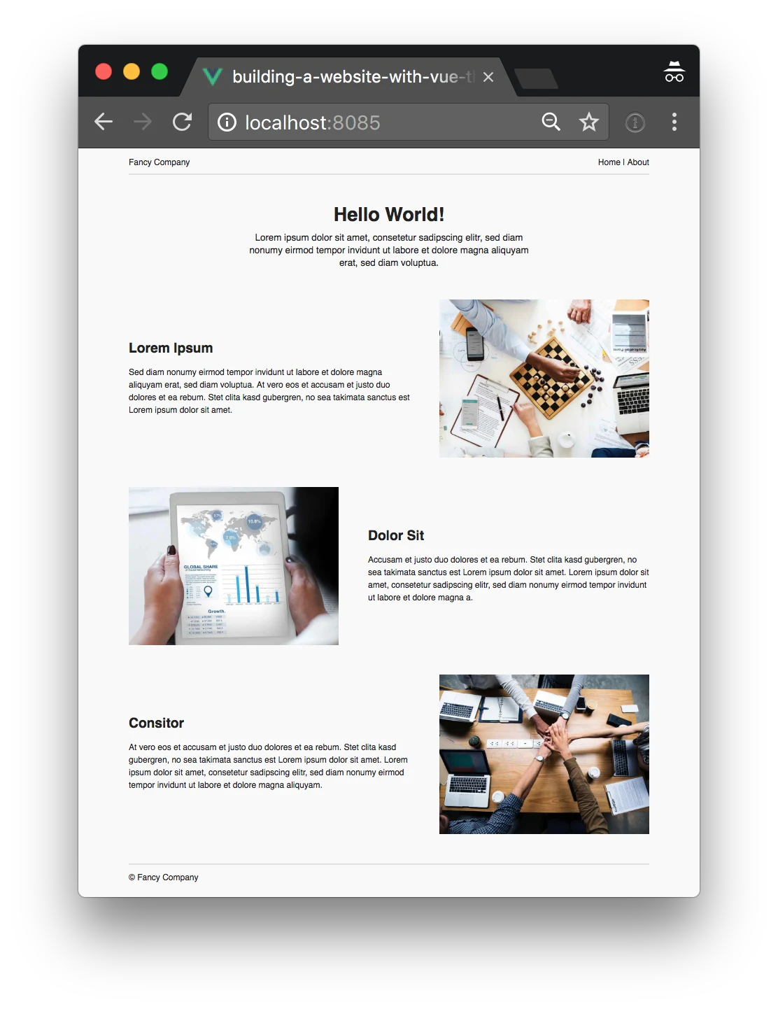
The final result of our work
Netlify deployment
Now we’re almost done. The last thing that’s missing: deployment.
Because Netlify is awesome and super easy to set up, we’ll use Netlify to deploy our little website. To make routing work on Netlify, we need to add a _redirects file into the public directory.
/* /index.html 200Before we move forward, a short warning: In the next step, we deploy two versions of our website to the world wide web, for everyone to see. One which is the public website, which calls the public Storyblok API and another one which we’ll use for the Storyblok Visual Editor, which loads draft versions of your content from the preview API. If your draft versions must stay secret, for example if you’re preparing your website for a big product launch and you don’t want anybody to know about it before the big release, you most likely do not want your draft versions available for everyone to see. So keep that in mind.
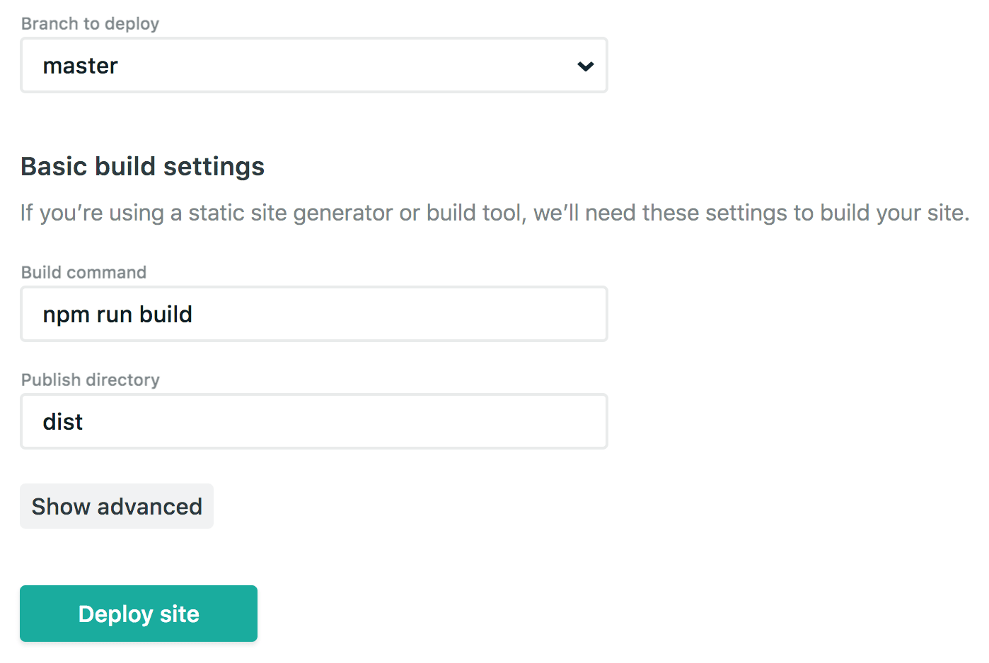
In Netlify, we create a new site from Git and choose the repository of our website. Next we enter the build command and the publish directory into the corresponding fields, like you can see in the following screenshots. Afterwards we can click “Deploy site”.
Congratulations, you’ve successfully deployed a website to the world wide web using Netlify.
Now we have to repeat the process but this time, we change the deployment command as you can see in the next screenshot.
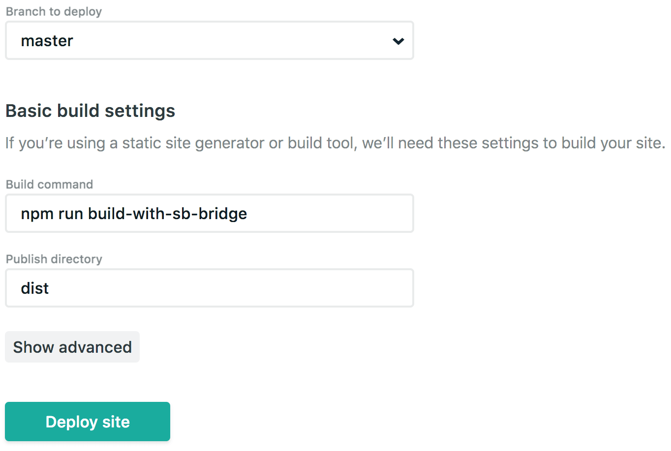
This is the deploy for our website including the Storyblok Bridge. We now can use the URL, which Netlify provides us, in Storyblok as the default location.
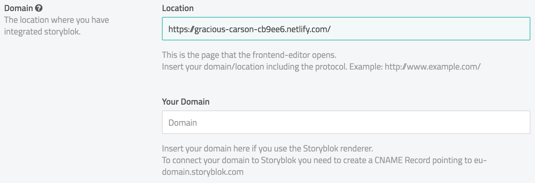
Now we can edit our Home content and change the environment to see the changes we make directly on the live version of the website.
Wrapping it up
Thanks to the rise of headless content management systems, we as frontend developers are able to use modern component based technologies like Vue.js the way they are intended to be used, opposed to setting up a CMS like Wordpress or Drupal and trying to somehow integrate Vue.js with those systems.
The Storyblok Visual Editor makes it very easy for people who are not web developers to edit their websites, so even many of those people will prefer Storyblok over their previous CMS.
Having said that, there are some hurdles to take when building mostly static websites with Vue.js. You absolutely should implement some kind of pre-rendering, at least for your most important content and you should always have an eye on the rendering performance on low-end devices.
If you want to, you can see a live preview of the website we’ve built hosted on Netlify and you can view all the code on GitHub.