Simple Solution for Anchor Links Behind Sticky Headers
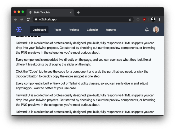
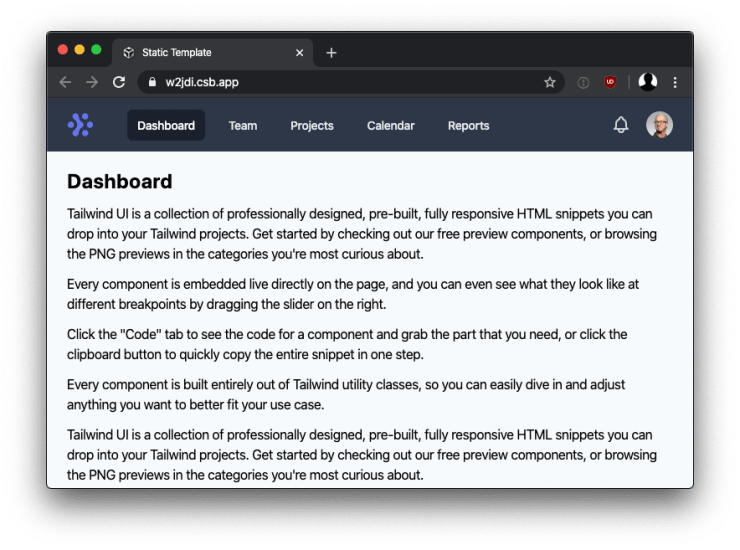
In my experience, customers love sticky headers. And indeed, they prove to be very useful in certain situations. But there are also terrible implementations of this pattern out there. And I cannot blame the developers who created them. Getting sticky headers right is harder than you might think.
In this article, we take a look at one of the pieces you need to solve to make sticky headers work great, rather than being a nuisance: anchor links disappearing behind sticky headers.

How to make anchor links work with sticky headers
In the past, I worked around this problem by adding some padding around potential anchor link targets. But probably the most elegant solution is to use scroll-margin-top.
// src/scss/navigation.scss

$sticky-breakpoint: 32em;

// 1. Approximate height of sticky navigation.
[id] {
  @media (min-height: $sticky-breakpoint) {
    scroll-margin-top: 100px; // 1
  }
}

.navigation {
  // ...

  @media (min-height: $sticky-breakpoint) {
    position: sticky;
    top: 0;
  }
}
As you can see in the example above, I highly recommend you to place the CSS scroll-margin-top to compensate the sticky header, as close to the styling of the sticky element itself. You have to make sure that if the height of the sticky element changes or if it’s only sticky on specific screen sizes, the scroll-margin-top is adapted accordingly.
The [id] selector targets all elements that have an id attribute because all of those potentially can become the target of an anchor link.

Alternative solution with scroll-padding-top
Depending on your use case, using scroll-padding-top directly on the html (or any other scroll container) element might be the more appropriate solution.
// src/scss/navigation.scss

$sticky-breakpoint: 32em;

// 1. Approximate height of sticky navigation.
html {
  @media (min-height: $sticky-breakpoint) {
    scroll-padding-top: 100px; // 1
  }
}

.navigation {
  // ...
}
Browser support
Browser support for scroll-margin-top and support for scroll-padding-top is pretty good. Because I consider hidden scroll anchors a minor inconvenience more than a serious issue, you most likely we’ll be fine without using a fallback for older browsers.
Wrapping it up
Like so often, the devil is in the details. If you use a sticky header and if you also use anchor links, make sure that they work well together. Thanks to scroll-margin-top this is easy to do.