Replicating the Twitter Tweet Box with Vue.js
Today we will take a look at how to replicate the Twitter Tweet Box (the text area you use to compose new tweets) using Vue.js. At first glance, the Tweet text field might look like a straightforward <textarea> element, but it is not. It’s certainly much more complicated than that. In this article, we’ll find out why the Twitter Tweet Box isn’t a simple <textarea> element and how the developers of Twitter have solved this problem. Furthermore, we’ll explore a more convenient way, of how we can recreate the same functionality in Vue.js.
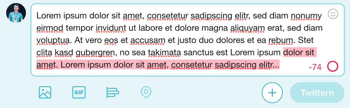
The final look of the Vue.js TweetBox component
If you want to check out the example yourself, without having to set up you own Vue.js build environment, you can take a look at the full code at GitHub or play around with a live demo of the Twitter Tweet Box implemented in Vue.js hosted on Netlify.
Challenges
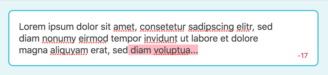
So why can’t we use a <textarea> field? The answer to this question becomes obvious when we enter a text into the Tweet field, which is longer than the maximum allowed characters.
Original Twitter Tweet Box with too much text
It isn’t possible to achieve the effect of highlighting all the characters, that are over the character limit, with a background color, by using a <textarea> (only). If we take a look at the source code, to see how this is solved on Twitter itself, we can see that they’re using a <div> with the contenteditable property set to true.
Although this is a very smart solution, this comes with its own set of problems, especially if you’re planning to build a Vue.js component and you want it to be compatible with v-model (which we want). To cut a long story short: I’ve tried really hard to replicate the same functionality in Vue.js using the contenteditable approach and ultimately, I failed.
The reason why it is very hard to make a contenteditable element work with v-model is because of the way how v-model works. Every time the value of the component (the text inside the contenteditable element) changes, the content inside the element is updated too. Which means that every time you write something inside the element, its value is updated, which resets the position of the caret to the beginning of the text inside of the element.
If you want to make this work, you have to save the caret position before updating the value, and reset the caret position immediately after the value is updated. Although this is doable, and a lot of WYSIWYG scripts are doing it that way, it is really complicated.
The (almost) invisible text area trick
I’ve lied to you. I said it isn’t possible to achieve the effect of highlighting too long text with using a <textarea>. But we actually can solve this problem without using contenteditable at all and instead use an (almost) invisible text area. Let’s explore how to do this.
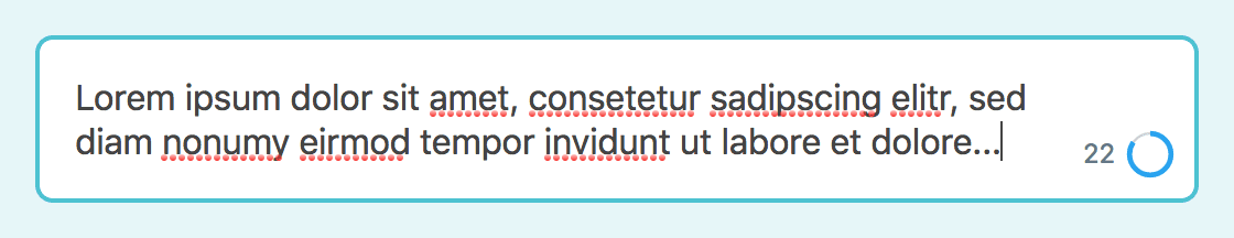
Basic markup and styling
First of all, we have to come up with the basic markup and functionality of our TweetBox component. We want the component to be compatible with v-model which means that it should basically work like a regular <textarea>.

The bare TweetBox component with basic styling
<template>
  <div :class="$options.name">
    <textarea
      :class="`${$options.name}__textarea`"
      :value="value"
      rows="1"
      @input="updateValue"
    />
  </div>
</template>

<script>
export default {
  name: "TweetBox",
  props: {
    value: {
      type: String,
    },
  },
  methods: {
    updateValue(e) {
      this.$emit("input", e.target.value);
    },
  },
};
</script>
.TweetBox {
$color-border: #99dde6;
&__textarea {
padding: 1em;
width: 100%;
border: 2px solid $color-border;
border-radius: 0.5em;
outline: 0;
resize: none;
&:focus {
border-color: darken($color-border, 20%);
}
}
}In the code above, you can see the basic markup and styling of our TweetBox. By binding the updateValue() method to the input event of the <textarea> element, we make sure the new value is emitted every time the user interacts with the text area.
Render the component
In order to render the component, we have to include it somewhere in our app. In the code below, you can see how to use the TweetBox component.
<template>
  <div :class="$options.name">
    <div :class="`${$options.name}__messageBox`">
      <tweet-box v-model="tweet" />
    </div>
  </div>
</template>

<script>
import TweetBox from "./TweetBox.vue";

export default {
  name: "App",
  components: {
    TweetBox,
  },
  data() {
    return {
      tweet: "",
    };
  },
};
</script>
Highlighting too long text
Now that we’ve implemented the very basic functionality of our component, let’s move on to recreate the most prominent functionality which is the reason why this is even worth an article in the first place: let’s highlight some text.

TweetBox component with highlighted text
Template
First of all, we have to make some minor changes to the template. As you can see in the diff beneath, we add a new <div> which we’ll use to render the current value with some additional markup which makes it possible to highlight those characters which are too much. We also add a textarea ref attribute onto the existing <textarea> element, this makes it possible to reference this HTML element inside the Vue component.
 <template>
   <div :class="$options.name">
+    <div
+      :class="`${$options.name}__htmlarea`"
+      aria-hidden
+    >{{ valueAllowed }}<em v-if="valueExcess">{{ valueExcess }}</em></div>
     <textarea
+      ref="textarea"
       :class="`${$options.name}__textarea`"
       :value="value"
       rows="1"
JavaScript
The changes in the JavaScript code of the component are a little bit more extensive. I’ve added comments directly in the code to clarify the more complicated parts.
 export default {
   name: 'TweetBox',
   props: {
+    limit: {
+      type: Number,
+      default: 140,
+    },
     value: {
       type: String,
     },
   },
+  computed: {
+    valueAllowed() {
+      return this.limit ? this.value.slice(0, this.limit) : this.value;
+    },
+    valueExcess() {
+      return this.limit ? this.value.slice(this.limit) : '';
+    },
+    limitStatus() {
+      return (this.value.length / this.limit) * 100;
+    },
+    textareaStyle() {
+      return getComputedStyle(this.$refs.textarea);
+    },
+  },
+  // It might be tempting to use a watcher instead of
+  // triggering `textareaGrow()` in both, the `mounted()`
+  // lifecycle hook and in the `updateValue()` method
+  // but because watchers, which are set to run immediately,
+  // are triggered before evaluating computed properties,
+  // a watcher wouldn't work.
+  mounted() {
+    this.textareaGrow();
+  },
   methods: {
     updateValue(e) {
+      this.textareaGrow();
       this.$emit('input', e.target.value);
     },
+    // Update the size of the textarea to fit the number
+    // of lines of text.
+    textareaGrow() {
+      const paddingTop = parseInt(this.textareaStyle.getPropertyValue('padding-top'), 10);
+      const paddingBottom = parseInt(this.textareaStyle.getPropertyValue('padding-bottom'), 10);
+      const lineHeight = parseInt(this.textareaStyle.getPropertyValue('line-height'), 10);
+
+      // Resetting the row count to `1` is necessary for
+      // recalculating the `scrollHeight` of the textarea.
+      this.$refs.textarea.rows = 1;
+
+      // We're calculating the inner height of the textare
+      // and take this value to also calculate the number
+      // of rows needed to fit the currently entered text.
+      const innerHeight = this.$refs.textarea.scrollHeight - paddingTop - paddingBottom;
+      this.$refs.textarea.rows = innerHeight / lineHeight;
+    },
   },
 };
The first change you can see above, is a new property limit which defines, well, the limit which defines the maximum characters. If this is reached, we highlight every additional character with a light red background.
Next you can see four new computed properties. The vallueAllowed() and valueExcess() properties, take the value and slice it to represent the allowed portion of the string and everything which exceeds the given limit. limitStatus() returns the percentage representation of how many characters the user has already entered relative to the limit. And last but not least, there is the textareaStyle() computed property, which returns the computed styles of the <textarea> HTML element.
The textareaGrow() method, takes care of the height of the text area. Every time a new row is added, the number of rows of the <textarea> element is updated to reflect the number of rows entered, so that there is never a scrollbar.
Styling
Beneath you can see the basic styling needed for our (almost) invisible text area trick to work. We basically make the background of the <textarea> invisible and move the <textarea> above the <div> with the class TweetBox__htmlarea. So what the user is actually seeing when they enter a too long value into the TweetBox, is the background color of the <em> tag inside the <div> element behind the <textarea> – the actual text is also replicated in the HTML area <div> behind the <textarea> but it is invisible.
 .TweetBox {
   $color-border: #99dde6;
+  $color-danger-light: #ffb8c2;
+
+  position: relative;

+  // 1. Account for the width of the remaining characters
+  //    and visual counters.
+  // 2. Harmonize differences between <div> and <textarea>.
+  &__htmlarea,
   &__textarea {
     padding: 1em;
-    width: 100%;
-    border: 2px solid $color-border;
+    padding-right: 3.75em; // 1
+    width: 100%; // 2
+    line-height: 1.25; // 2
+    border: 2px solid transparent;
     border-radius: 0.5em;
+  }
+
+  // 1. Remove the element from the normal document flow,
+  //    so the <textarea> lies above this element, and
+  //    make the HTML area <div> as tall as the <textarea>.
+  // 2. Make the text color transparent, so only the
+  //    background color of the <em> is visible.
+  // 3. Make word breaks behave exactly like in a textarea.
+  &__htmlarea {
+    position: absolute; // 1
+    height: 100%; // 1
+    background-color: #fff;
+    color: transparent; // 2
+    white-space: pre-wrap; // 3
+    word-wrap: break-word; // 3
+  }
+
+  // 1. Make the <textarea> a block level element to make
+  //    its sizing behave like that of a <div>.
+  // 2. By making the background color transparent, the user
+  //    sees the content of the HTML area <div> behind the <textarea>.
+  &__textarea {
+    display: block; // 1
+    position: relative;
+    border-color: $color-border;
     outline: 0;
+    background-color: transparent; // 2
     resize: none;

     &:focus {
       border-color: darken($color-border, 20%);
     }
   }
+
+  em {
+    background: $color-danger-light;
+  }
 }
Show remaining characters
Puhh, that was quite hard, but trust me, we’ve gone through the most complicated parts of this article. Next we want to show to the user how much they’ve already entered and how much characters they’ve left.
Character count
Let’s start with a simple counter that shows how many characters are still allowed to enter.
TweetBox component with remaining characters count
 <template>
-  <div :class="$options.name">
+  <div
+    :class="[
+      $options.name,
+      {
+        'has-exceeded-limit': limitStatus > 100,
+      },
+    ]"
+  >
     <div
       :class="`${$options.name}__htmlarea`"
       aria-hidden
     >{{ valueAllowed }}<em v-if="valueExcess">{{ valueExcess }}</em></div>
     <textarea
       ref="textarea"
       :class="`${$options.name}__textarea`"
       :value="value"
       rows="1"
       @input="updateValue"
     />
+    <div :class="`${$options.name}__limit`">
+      <span :class="`${$options.name}__remainingCharacters`">
+        {{ remainingCharacters }}
+      </span>
+    </div>
   </div>
 </template>
limitStatus() {
return (this.value.length / this.limit) * 100;
},
+ remainingCharacters() {
+ return this.limit - this.value.length;
+ },
textareaStyle() {
return getComputedStyle(this.$refs.textarea);
}, .TweetBox {
$color-border: #99dde6;
+ $color-danger: #e0245e;
$color-danger-light: #ffb8c2;
+ $color-gray: #657786;
//...
em {
background: $color-danger-light;
}
+
+ &__limit {
+ display: flex;
+ position: absolute;
+ right: 0.75em;
+ bottom: 0.75em;
+ align-items: center;
+ }
+
+ &__remainingCharacters {
+ margin-right: 0.5em;
+ color: $color-gray;
+ font-size: 0.75em;
+
+ .has-exceeded-limit & {
+ color: $color-danger;
+ }
+ }
}In the code snippets above, you can se that we’ve added a has-exceeded-limit class which is attached to the root element as soon as the limitStatus is higher than 100%. Also we’ve added a new <div> for grouping our visual representations of the character limit, starting with the remainingCharacters (which are calculated by a new computed property). In the style section you can see the code necessary for positioning the new elements and for setting the color to $color-danger in the case of having exceeded the character limit.
Do you want to learn more about advanced Vue.js techniques?
Register for the Newsletter of my upcoming book: Advanced Vue.js Application Architecture.
Visual counter
Next we want to add a visual represenation of the amount of characters already entered relative to the limit.
TweetBox component with visual SVG circle counter
       <span :class="`${$options.name}__remainingCharacters`">
         {{ remainingCharacters }}
       </span>
+      <svg
+        :class="`${$options.name}__counter`"
+        viewBox="0 0 33.83098862 33.83098862"
+        height="20"
+        width="20"
+        xmlns="http://www.w3.org/2000/svg"
+      >
+        <circle
+          :class="`${$options.name}__counterUnderlay`"
+          cx="16.91549431"
+          cy="16.91549431"
+          r="15.91549431"
+          fill="none"
+          stroke-width="2"
+        />
+        <circle
+          :class="`${$options.name}__counterProgress`"
+          :stroke-dasharray="`${limitStatus},100`"
+          cx="16.91549431"
+          cy="16.91549431"
+          r="15.91549431"
+          fill="none"
+          stroke-width="4"
+        />
+      </svg>
     </div>
   </div>
 </template>
In the template above, you can see that we’ve added an SVG containing two circles to represent the current status of how many characters were already entered. You can read more about some tricks for creating SVG circles in the following article: Creating a Pure CSS Animated SVG Circle Chart.
Another important thing to note is, that we’re using the camel case notation for the viewBox attribute. If you use viewbox instead, the browser won’t parse the SVG correctly.
   // ...
   $color-gray: #657786;
+  $color-gray-light: #ccd6dd;
+  $color-primary: #1da1f2;

   // ...

+  // 1. Making overflowing content visible, because
+  //    otherwise the `counterPulse` animation would be
+  //    cut off.
+  &__counter {
+    overflow: visible; // 1
+    transform: rotate(-90deg);
+    transform-origin: center;
+  }
+
+  &__counterUnderlay {
+    stroke: $color-gray-light;
+  }
+
+  &__counterProgress {
+    stroke: $color-primary;
+
+    .has-exceeded-limit & {
+      stroke: $color-danger;
+      animation: counterPulse 0.3s ease-in-out;
+      animation-iteration-count: 1;
+    }
+  }
+
+  @keyframes counterPulse {
+    0% { stroke-width: 4; }
+    50% { stroke-width: 6; }
+    100% { stroke-width: 4; }
+  }
 }
The styling of the visual counter adds a little animation which is triggered as soon as the has-exceeded-limit class is added to the root element of the component.
Wrapping it up
Believe it or not, that was one of the hardest problems I’ve ever dealt with in a blog article. Although the final solution seems to be relatively simple and straightforward, I spent a lot of time trying to bend a contenteditable element to my will.
After I’ve abandoned the plan of using contenteditable, and I came up with the basic idea for the (almost) invisible text area, it took some additional hours until I finally figured out how to make the text in the <div>, containing the HTML representation of the value, behave exactly like the text in the <textarea> when it comes to word breaks.
But in the end, I’m pretty proud of the outcome. I think it’s simpler than the original implementation and thanks to Vue.js and v-model also more powerful.
You can check out the full code at GitHub or play around with a live demo of the Twitter Tweet Box implemented in Vue.js hosted on Netlify.