Context-Aware Props in Vue.js Components
Recently I saw an interesting Tweet by Mark Dalgleish, about the idea of contextual defaults for React components. I was especially interested in this because I had to solve a similar problem only a few days before.
The Context-Aware Component Pattern
Table of Contents
Basic Concept
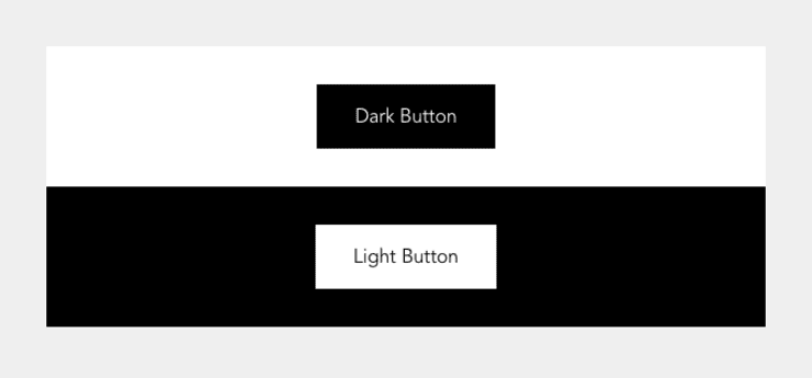
In the following screenshot, you can see two buttons: a dark button on a white background and a light button on a black background.
<template>
  <BaseIsland background-color="white">
    <BaseButton> Dark Button </BaseButton>
  </BaseIsland>
  <BaseIsland background-color="black">
    <BaseButton> Light Button </BaseButton>
  </BaseIsland>
</template>
You can see that both buttons are initialized the same way, without any modifier properties. This means that the buttons are context-aware and change their looks according to the context (BaseIsland) instead of us having to set a property explicitly.
Pure CSS Solution
If you are an old school CSS ninja, you immediately know how we can utilize nesting to solve this problem.
.c-button {
  // ...
  background-color: #444;
  color: #fff;
}

.s-background-dark .c-button {
  background-color: #fff;
  color: #444;
}
But there is a reason why we mostly avoid to write nested styles. It requires a lot of discipline to keep our CSS sane in the long run if we liberally rely on nesting.
The Context-Aware Component Pattern
In one of my earlier articles, I wrote about how to replicate React Context in Vue.js. Let’s take a look at how we can use this pattern to provide context-aware default properties for our BaseButton component.
<!-- src/components/ProvideBackgroundColor.vue -->
<template>
  <slot />
</template>

<script>
import { computed, provide } from "vue";

export const BackgroundColorProviderSymbol = Symbol(
  "Background color provider identifier",
);

// For simplicity we define those constants in here. In a real
// application those would probably come from a global configuration.
const COLORS_DARK = ["black", "darkGray"];
const COLORS_LIGHT = ["white", "lightGray"];
const COLORS = [...COLORS_DARK, ...COLORS_LIGHT];

export const TONE = {
  dark: "dark",
  light: "light",
};

export default {
  props: {
    backgroundColor: {
      default: "white",
      type: String,
      // Check if the given color is valid.
      validator(value) {
        return COLORS.includes(value);
      },
    },
  },
  setup(props) {
    // Make sure the `backgroundColor` we provide is reactive.
    let backgroundColor = computed(() => props.backgroundColor);
    // We can have unlimited background colors but only two tones.
    // But depending on your use-case, there can also be more tones.
    let backgroundTone = computed(() => {
      let isDarkTone = COLORS_DARK.includes(props.backgroundColor);
      return isDarkTone ? TONE.dark : TONE.light;
    });

    provide(BackgroundColorProviderSymbol, {
      backgroundColor,
      backgroundTone,
    });
  },
};
</script>
The provider component above takes a backgroundColor property and, depending on its value, decides if the backgroundTone of the background color is dark or light. Child components can now get the information in which background context they are rendered and change their look or even their behavior accordingly.
<!-- src/components/BaseIsland.vue -->
<template>
  <ProvideBackgroundColor :background-color="backgroundColor">
    <div :class="`bg-${backgroundColor} p-${padding}`">
      <slot />
    </div>
  </ProvideBackgroundColor>
</template>

<script>
import ProvideBackgroundColor from "./ProvideBackgroundColor.vue";

export default {
  components: {
    ProvideBackgroundColor,
  },
  props: {
    backgroundColor: {
      default: "white",
      type: String,
    },
    padding: {
      default: "12",
      type: String,
    },
  },
};
</script>

<style>
.bg-white {
  background-color: white;
}

.bg-black {
  background-color: black;
}

/* ... */
</style>
The BaseIsland component above is a simple abstraction for some boxed-off content with some padding around it and a background color. We use the ProvideBackgroundColor component to inform all child components about the background color of one of their parent components.
Do you want to learn more about advanced Vue.js techniques?
Register for the Newsletter of my upcoming book: Advanced Vue.js Application Architecture.
Next, we want to create a context-aware BaseButton component. To make this easier for us to do, we first create a component factory function that serves as an abstraction to make components context-aware quickly.
// src/utils/context-aware-component-factory.js
import { h, inject, unref } from "vue";

export function contextAwareComponentFactory(component) {
  let contextAwareProps = {};
  let contextAwareComponent = (props, { attrs, slots }) => {
    // Make it possible to use the context-aware component as the default
    // export. The Vue SFC compiler appends the render function generated from
    // the <template> section to the object exported as the default export. In
    // this case, it is appended to `contextAwareComponent`.
    if (contextAwareComponent.render) {
      component.render = contextAwareComponent.render;
    }

    let options = { ...attrs };

    for (let [propName, propOptions] of Object.entries(component.props)) {
      let isContextAware = Boolean(propOptions.context);
      if (!isContextAware) continue;

      let contextId = propOptions.context.id || propOptions.context;
      let context = inject(contextId, null);
      let hasContext = Boolean(context);
      if (!hasContext) continue;

      let fallbackResolver = () => unref(context[propName]);
      let resolveContextValue = propOptions.context.adapter || fallbackResolver;

      // Do not override explicitly set props.
      options[propName] = props[propName] || resolveContextValue(context);
      contextAwareProps[propName] = propOptions;
    }

    return h(component, options, slots);
  };

  contextAwareComponent.props = contextAwareProps;

  return contextAwareComponent;
}
The contextAwareComponentFactory() above takes a component, and checks its props option for props with a context property. It returns a new component, which renders the given component with pre-set values for the given context-aware props.
<!-- src/components/BaseButton.vue -->
<template>
  <button :class="[backgroundClass, textColorClass]">
    <slot />
  </button>
</template>

<script>
import { computed, unref } from "vue";

import { contextAwareComponentFactory } from "../utils/context-aware-component-factory";
import { TONE, BackgroundProviderSymbol } from "./ProvideBackground.vue";

export default contextAwareComponentFactory({
  name: `BaseButton`,
  props: {
    tone: {
      context: {
        // If the background tone is `dark`, the button
        // tone must be `light` and vice versa.
        adapter: (context) =>
          unref(context.backgroundTone) === TONE.dark ? TONE.light : TONE.dark,
        id: BackgroundProviderSymbol,
      },
      default: TONE.dark,
      type: String,
    },
  },
  setup(props) {
    let backgroundClass = computed(() =>
      props.tone === TONE.dark ? `bg-black` : `bg-white`,
    );
    let textColorClass = computed(() =>
      props.tone === TONE.dark ? `text-white` : `text-black`,
    );

    return {
      backgroundClass,
      textColorClass,
    };
  },
});
</script>

<style>
.bg-black {
  background-color: black;
}

.bg-white {
  background-color: white;
}

/* ... */
</style>
In BaseButton.vue, we export a context-aware variant of our button component. We can see that we use an adapter function to set the tone property according to its context. If we only need a 1:1 mapping between context and component prop, we can simply configure the context as context: BackgroundProviderSymbol. But in this case, the button’s tone needs to be the exact opposite of the context’s tone.
<template>
  <BaseIsland background-color="black">
    <BaseButton tone="light"> Manual set tone </BaseButton>
    <BaseButton> Context-Aware Button </BaseButton>
  </BaseIsland>
</template>

<script>
import BaseButton from "./BaseButton.vue";
// ...
</script>
The first instance of BaseButton in the example above has its tone property manually set. While the first BaseButton’s tone is static, the second button will automatically adapt to the background color of the parent BaseIsland component.
Wrapping It Up
Although this is a potent pattern, it suffers from some of the same problems as nested CSS: it is not always immediately apparent where individual styles come from. On the other hand, this pattern is even more powerful because we can modify the looks of a component and its functionality based on its context. If you decide to use a similar approach in your codebase, be aware of its potential downsides and make sure that everybody who works with the codebase is on the same page.