Building Custom Multi-Option Form Components with Vue.js
In my opinion, one of the most significant features of Vue.js, is the ability to build custom form components with ease. Thanks to v-model and the straightforward event system, we can build powerful new form components or enhance existing form fields and input types with superpowers.
Multiple values selected and rendered as a table of products
Today we focus on building custom form components for selecting multiple options in various ways. The first component we build is an enhanced version of the default HTML select tag. Next, we take a look at how to build a custom multi checkbox form element. To top it all off, we explore how to build a simple tagging form element with Vue.js.
You can find a live demo of all the components featured in this article, hosted on Netlify. If you want to check out the full code powering the demo, you can find it on GitHub.
Basics
Let’s start with the basics. In the example below, you can see a streamlined implementation of a custom select form component.
<template>
  <select :class="$options.name" v-model="selected" @change="updateValue">
    <option disabled value="" v-text="disabledOption" />
    <option
      v-for="option in options"
      :key="option"
      :value="option"
      v-text="option"
    />
  </select>
</template>

<script>
export default {
  name: "FormSelect",
  model: {
    // By default, `v-model` reacts to the `input`
    // event for updating the value, we change this
    // to `change` for similar behavior as the
    // native `<select>` element.
    event: "change",
  },
  props: {
    // The disabled option is necessary because
    // otherwise it isn't possible to select the
    // first item on iOS devices. This prop can
    // be used to configure the text for the
    // disabled option.
    disabledOption: {
      type: String,
      default: "Select something",
    },
    options: {
      type: Array,
      default: () => [],
    },
    value: {
      type: [String, Number],
      default: null,
    },
  },
  data() {
    return {
      selected: this.value,
    };
  },
  methods: {
    updateValue() {
      // Emitting a `change` event with the new
      // value of the `<select>` field, updates
      // all values bound with `v-model`.
      this.$emit("change", this.selected);
    },
  },
};
</script>
The basic component you can see above, makes it possible to pass an array of options to the component (<form-select :options="['Foo', 'Bar']"/>) and by emitting a change event whenever the <select> field is updated, a v-model update is triggered.
Selecting multiple options
So far so good, our custom select component makes it possible to select an option and returns its value. Next we want to make it possible for the user to select multiple options. Let’s make some changes to our code to make it possible to use the multiple attribute on the <select> tag.
     value: {
-      type: [String, Number],
+      type: [Array, String, Number],
       default: null,
     },
   },
   data() {
     return {
       selected: this.value,
     };
   },
+  computed: {
+    multiple() {
+      return Array.isArray(this.value);
+    },
+  },
   methods: {
     updateValue() {
In the diff above, you can see, that we now allow the value property to be of type Array. The new computed property multiple() is true if value is an array. To make it possible to select multiple values we have to add a multiple property to the <select> tag of our component. So by passing a value of type Array to our FormSelect component, we enable the <select> element to make it possible to support selecting multiple values.
 <template>
   <select
     :class="$options.name"
+    :multiple="multiple"
     v-model="selected"
     @change="updateValue"
   >
Here you can see a usage example of the FormSelect component with multi select enabled.
<form-select v-model="value" :options="['A', 'B']" />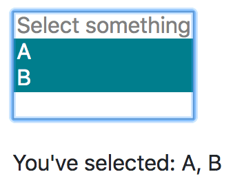
Multiple simple values selected
Complex values
The simple example above, already does its job pretty well, but the primary goal, that we want to achieve with our custom-made form elements, is, that we’re able to provide complex values and get complex values back. Let’s take a look at what I’ mean by “complex values”.
<form-select v-model="selectedProduct" :options="products" />export default {
// ...
data() {
return {
selectedProduct: null,
products: [
{
uuid: 'fbf2078e-06cb-4ad5-9781-1a9ba59e7341'.
name: 'iPhone',
price: 799,
},
{
uuid: '6c0aa519-2972-4fb2-86c1-e114febd079d'.
name: 'iPad',
price: 499,
},
],
};
},
// ...
};We want to be able to provide an array of objects (a list of products for example) as options to a form field, we want the user to be able to select one of those objects and we want to get back the object as the selected value of the form field component via v-model.
Do you want to learn more about advanced Vue.js techniques?
Register for the Newsletter of my upcoming book: Advanced Vue.js Application Architecture.
Select field with objects as values
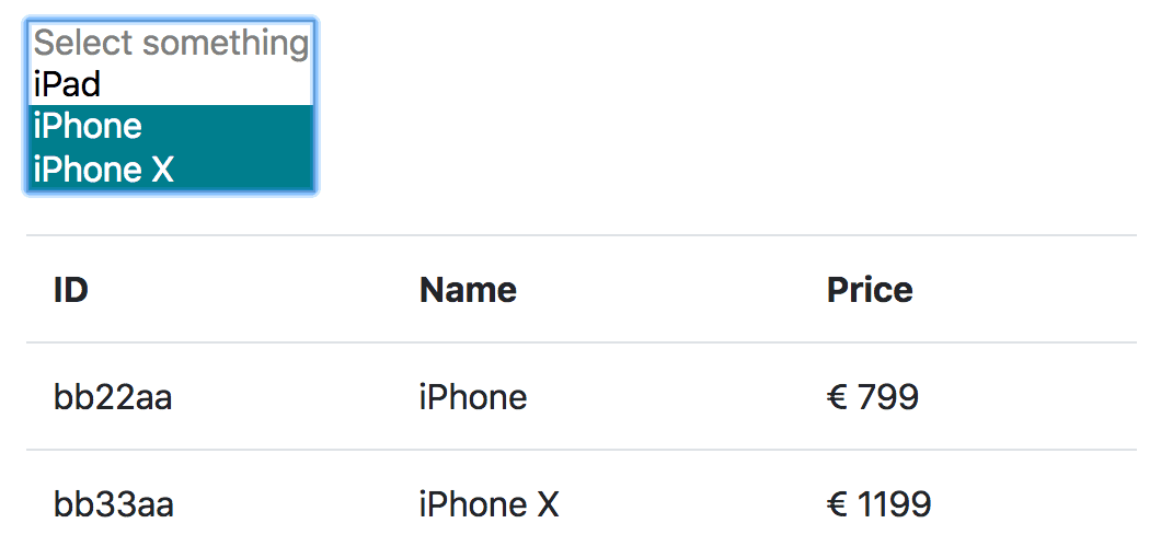
As you can see in the screenshot below, the custom select component we’re going to build, makes it possible to select one or multiple products (which are defined as objects with all the data of the products) which we can directly render in a table view without having to map the values of the select component manually to match products in an array.
Multiple values selected and rendered as a table of products
       default: 'Select something',
     },
+    // The option adapter is responsible for
+    // transforming the values and options,
+    // provided in a certain format, to valid
+    // option objects. You can pass your own
+    // `optionAdapter()` as property to make the
+    // component work with your custom data
+    // structure
+    optionAdapter: {
+      type: Function,
+      default: value => ({
+        id: value,
+        label: value,
+        value,
+      }),
+    },
     options: {
       type: Array,
       default: () => [],
     },
     value: {
-      type: [Array, String, Number],
+      type: [Array, String, Number, Object],
       default: null,
     },
   },
   data() {
     return {
-      selected: this.value,
+      // A computed property can't be used
+      // because `data` is evaluated first.
+      selected: Array.isArray(this.value)
+        ? this.value.map(x => this.optionAdapter(x).id)
+        : this.value && this.optionAdapter(this.value).id,
     };
   },
   computed: {
+    adaptedOptions() {
+      return this.options.map(x => this.optionAdapter(x));
+    },
     multiple() {
       return Array.isArray(this.value);
     },
   },
   methods: {
     updateValue() {
+      const newValue = this.multiple
+        ? this.selected.map(id => this.adaptedOptions.find(x => x.id === id).value)
+        : this.adaptedOptions.find(x => x.id === this.selected).value;
+
       // Emitting a `change` event with the new
       // value of the `<select>` field, updates
       // all values bound with `v-model`.
-      this.$emit('change', this.selected);
+      this.$emit('change', newValue);
     },
   },
 };
As you can see above, we’ve made some substantial changes to our FormSelect component. Let’s take a look at the most important pieces of it.
The optionAdapter() property is a function, which takes a value as its input and returns a valid option object. The default optionAdapter() assumes value is either a String or a Number but you can pass your own optionAdapter() as a property of your instance of the FormSelect component to make it possible to work with more complex values like objects.
It also got a little bit more complicated to determine the initial value of selected. Instead of using the value directly, we use the id property of the option object returned by the optionAdapter(). This is necessary because value can now be an object (or an array of objects) and the v-model on the <select> element can’t handle object values.
The adaptedOptions() computed property takes the options which are passed to the component instance and transforms them to valid option objects.
In the updateValue() method, we now have to determine which options are selected by comparing the ID’s of the option objects with the values of selected. We emit the value property of the option object(s) as the new value of the component – this makes it possible to pass a list of objects as options and get back the same (selected) objects as value(s).
<form-select
  v-model="value"
  :options="[
    { uuid: 1, name: 'Foo' },
    { uuid: 2, name: 'Bar' },
  ]"
  :option-adapter="
    (value) => ({
      id: value.uuid,
      label: value.name,
      value,
    })
  "
/>
In the code snippet above, you can see how to use the FormSelect component with objects as options and a custom optionAdapter() to transform the options and values into valid option objects.
Multiple checkboxes with object values
The custom select component we’ve built is nice, but sometimes a select field is not the best form of input. In some cases we might show the user a list of checkboxes from which they can choose. But before we build a new multi checkbox input component, let’s refactor our existing code first.
Extract reusable code into a mixin
Vue.js provides multiple ways of how you can reuse code. Just some weeks ago, Adam Wathan wrote a wonderful article about Renderless Components in Vue.js. Although I was thinking about using this approach for this article, ultimately I decided to use a mixin. One reason why I choose to use a mixin, is because we need a lot of properties which we’d all have to pass through our component into the renderless component and back again.
 <script>
+import formOptionSelectMixin from './mixins/form-option-select-mixin';
+
 export default {
   name: 'FormSelect',
-  model: {
-    // By default, `v-model` reacts to the `input`
-    // event for updating the value, we change this
-    // to `change` for similar behavior as the
-    // native `<select>` element.
-    event: 'change',
-  },
+  mixins: [formOptionSelectMixin],
   props: {
     // The disabled option is necessary because
     // otherwise it isn't possible to select the
     // first item on iOS devices. This prop can
     // be used to configure the text for the
     // disabled option.
     disabledOption: {
       type: String,
       default: 'Select something',
     },
-    // The option adapter is responsible for
-    // transforming the values and options,
-    // provided in a certain format, to valid
-    // option objects. You can pass your own
-    // `optionAdapter()` as property to make the
-    // component work with your custom data
-    // structure
-    optionAdapter: {
-      type: Function,
-      default: value => ({
-        id: value,
-        label: value,
-        value,
-      }),
-    },
-    options: {
-      type: Array,
-      default: () => [],
-    },
-    value: {
-      type: [Array, String, Number, Object],
-      default: null,
-    },
-  },
-  data() {
-    return {
-      // A computed property can't be used
-      // because `data` is evaluated first.
-      selected: Array.isArray(this.value)
-        ? this.value.map(x => this.optionAdapter(x).id)
-        : this.value && this.optionAdapter(this.value).id,
-    };
-  },
-  computed: {
-    adaptedOptions() {
-      return this.options.map(x => this.optionAdapter(x));
-    },
-    multiple() {
-      return Array.isArray(this.value);
-    },
-  },
-  methods: {
-    updateValue() {
-      const newValue = this.multiple
-        ? this.selected.map(id => this.adaptedOptions.find(x => x.id === id).value)
-        : this.adaptedOptions.find(x => x.id === this.selected).value;
-
-      // Emitting a `change` event with the new
-      // value of the `<select>` field, updates
-      // all values bound with `v-model`.
-      this.$emit('change', newValue);
-    },
   },
 };
We can remove almost all of the code from the FormSelect component and move it into a new mixin file you can see below.
// src/components/mixins/form-option-select-mixin.js
export default {
  model: {
    // By default, `v-model` reacts to the `input`
    // event for updating the value, we change this
    // to `change` for similar behavior as the
    // native `<select>` element.
    event: "change",
  },
  props: {
    // The option adapter is responsible for
    // transforming the values and options,
    // provided in a certain format, to valid
    // option objects. You can pass your own
    // `optionAdapter()` as property to make the
    // component work with your custom data
    // structure
    optionAdapter: {
      type: Function,
      default: (value) => ({
        id: value,
        label: value,
        value,
      }),
    },
    options: {
      type: Array,
      default: () => [],
    },
    value: {
      type: [Array, String, Number, Object],
      default: null,
    },
  },
  data() {
    return {
      // A computed property can't be used
      // because `data` is evaluated first.
      selected: Array.isArray(this.value)
        ? this.value.map((x) => this.optionAdapter(x).id)
        : this.value && this.optionAdapter(this.value).id,
    };
  },
  computed: {
    adaptedOptions() {
      return this.options.map((x) => this.optionAdapter(x));
    },
    multiple() {
      return Array.isArray(this.value);
    },
  },
  methods: {
    updateValue() {
      const newValue = this.multiple
        ? this.selected.map(
            (id) => this.adaptedOptions.find((x) => x.id === id).value,
          )
        : this.adaptedOptions.find((x) => x.id === this.selected).value;

      // Emitting a `change` event with the new
      // value of the `<select>` field, updates
      // all values bound with `v-model`.
      this.$emit("change", newValue);
    },
  },
};
The multi checkbox component
Now that we’ve extracted the core functionality of our multi select component into a mixin, we can reuse the same mixin to build a new multi checkbox component.
<template>
  <div :class="$options.name">
    <div
      v-for="option in adaptedOptions"
      :key="option.id"
      :class="`${$options.name}__option`"
    >
      <label>
        <input
          :class="`${$options.name}__input`"
          :value="option.id"
          v-model="selected"
          type="checkbox"
          @change="updateValue"
        />
        {{ option.label }}
      </label>
    </div>
  </div>
</template>

<script>
import formOptionSelectMixin from "./mixins/form-option-select-mixin";

export default {
  name: "FormCheckbox",
  mixins: [formOptionSelectMixin],
};
</script>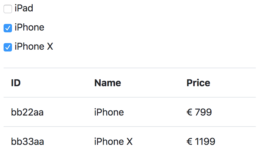
Multiple values checked and rendered as a table of products
In the screenshot above, you can see our multi checkbox component in action. Every checked checkbox returns a product object as its value. We can directly use this object to render a table of products.
The public API of our new FormCheckbox component is exactly the same as for the FormSelect component.
<form-checkbox
  v-model="value"
  :options="[
    { uuid: 1, name: 'Foo' },
    { uuid: 2, name: 'Bar' },
  ]"
  :option-adapter="
    (value) => ({
      id: value.uuid,
      label: value.name,
      value,
    })
  "
/>
Custom tagging form component
As you’ve already seen in the previous chapter, the mixin we’ve built earlier, is quite powerful. We were able to achieve the desired functionality without having to write a single additional line of JavaScript. Our next goal is to build a tagging form component with the same core functionality. But this time, we have to write some additional code to make it work.
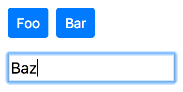
Simple tag input field
Render an array of values as tags
Let’s start with the basic functionality to render a given array of values as selected tags.
<template>
  <div :class="$options.name">
    <ul v-if="tagOptions.length" class="list-inline">
      <li v-for="tag in tagOptions" :key="tag.id" class="list-inline-item">
        <button class="btn btn-primary btn-sm">{{ tag.label }}</button>
      </li>
    </ul>
  </div>
</template>

<script>
import formOptionSelectMixin from "./mixins/form-option-select-mixin";

export default {
  name: "FormTagsInput",
  mixins: [formOptionSelectMixin],
  computed: {
    tagOptions() {
      return this.value.map((x) => this.optionAdapter(x));
    },
  },
};
</script>
In the example code above, you can see that we’re again using the mixin which we’ve created earlier as basis for our FormTagsInput component. To render the tags as a list of buttons, we create a valid option object from the given value via the computed property tagOptions().
Add new tags
Next we want to make it possible to add new tags.
       </li>
     </ul>
+    <input
+      v-model="newTag"
+      @keydown.enter="addTag"
+    >
   </div>
 </template>
name: 'FormTagsInput',
mixins: [formOptionSelectMixin],
+ props: {
+ newTagAdapter: {
+ type: Function,
+ default: value => value,
+ },
+ },
+ data() {
+ return {
+ newTag: '',
+ };
+ },
computed: {
+ newTagOption() {
+ return this.optionAdapter(this.newTagValue);
+ },
+ newTagValue() {
+ const trimmedNewTag = this.newTag.trim();
+
+ return trimmedNewTag.length > 0
+ ? this.newTagAdapter(trimmedNewTag)
+ : null;
+ },
tagOptions() {
return this.value.map(x => this.optionAdapter(x));
},
},
+ methods: {
+ addTag() {
+ if (!this.newTagValue || this.tagOptions.find(({ id }) => id === this.newTagOption.id)) {
+ return;
+ }
+
+ this.$emit('change', [...this.value, this.newTagValue]);
+ this.newTag = '';
+ },
+ },Let’s walk though the code you can see above. First, we’ve added a new <input> element to our template, to make it possible to enter a string which we convert into a tag as soon as the user presses enter.
The newTagAdapter() works similar to the optionAdapter() but more or less in the opposite direction. The newTagAdapter() takes the string of the <input> field as its parameter and converts it into a value in the correct format to serve as value. The default implementation simply returns the value but you can provide your own custom newTagAdapter() function to convert the value into an object.
To make it more convenient to access the newValue we’ve added two new computed properties. The newTagValue() computed property, which returns null if the trimmed newValue is empty or the value returned by the newTagAdapter(), and the newTagOption() property, which returns a valid option object generated from the value returned by the newTagValue() computed property.
In the addTag() method, we first check if the newTagValue is not empty, and if it’s unique. If not, no new tag is added. Otherwise, the newTagValue is added to the array of existing values and the new result is emitted as the new value of the component. By setting newTag to be an empty string, we’re clearing the value in the <input> tag.
Remove existing tags
Last but not least, we most likely want to give the user the possibility to remove tags they’ve added.
         <button
           class="btn btn-primary btn-sm"
+          @click="removeTag(tag)"
         >
-          {{ tag.label }}
+          {{ tag.label }} (x)
         </button>
       </li>
this.$emit('change', [...this.value, this.newTagValue]);
this.newTag = '';
},
+ removeTag(tag) {
+ this.$emit('change', this.value.filter(x => this.optionAdapter(x).id !== tag.id));
+ },
},
};
</script>Only small changes are needed to make it possible to remove existing tags. We’ve added an event listener onto the tag button element to call the new removeTag() method whenever it is clicked.
The removeTag() method filters the given tag from the value and emits the result (the value array without the given tag) as new value of the component.
How to use the tags input component
As you can see in the example below, the public API of the FormTagsInput component, is almost identical with the FormSelect and FormCheckbox components.
<form-tags-input
  v-model="value"
  :option-adapter="
    (value) => ({
      id: value.uuid,
      label: value.name,
      value,
    })
  "
  :new-tag-adapter="
    (value) => ({
      uuid: value,
      name: value,
    })
  "
/>Wrapping it up
Although there are other approaches how you can achieve similar results by using computed properties, not inside of the form component but inside the component which is consuming the form component, I think this approach makes it easier to handle complex form data. Especially for apps which have to juggle a large number of form fields, it can make things a lot easier if you’re abstracting the logic away into the form components themselves.
If you have further questions regarding this topic, let’s discuss them on Twitter.