Building a Custom Storyblok Field Type Plugin With Vue.js
I’m currently invested in exploring the world of headless content management systems and how to use modern web frameworks – like Vue.js – to build applications and websites on top of them. One of my favorite headless CMS so far is Storyblok, especially because it makes it possible to roll your own field type plugins with Vue.js.
In my recent article I wrote about how to build a simple website with Storyblok. In today’s article, we’ll take a closer look at the powerful Storyblok plugin system, which makes it possible to build any content structure we can think of, with the Storyblok CMS.
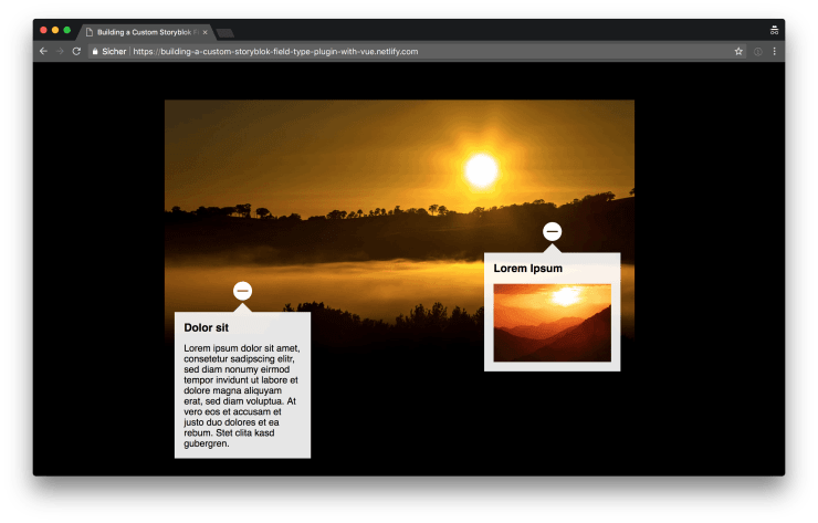
The plugin we build is called augmented-image. It enables the user to upload an image and extend it with multiple markers to add additional detail information (text and image) to certain areas of the image. You can see a demo of the final result of the output produced by the plugin, hosted on Netlify. Also you can find the repository for the plugin and the repository for the demo page on GitHub.
The basics
Before we start building our image augmentation plugin, let’s take a look at the basic principles of building Storyblok plugins. The best way to get started is to read the official guide about this topic.
For very simple plugins, you can get away with working with the in browser code editor provided by the Storyblok UI. For everything that gets more complicated than one or two simple text fields, I highly recommend you to set up a local development environment.
Our first simple Storyblok plugin
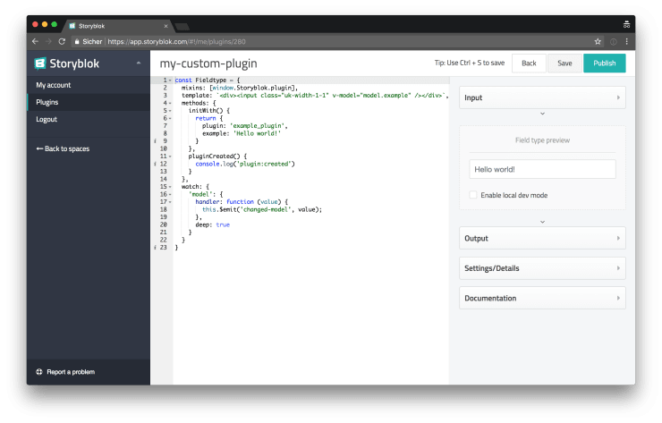
Beneath you can see the code for a very simple Storyblok field type plugin.
<template>
  <div>
    <input class="uk-width-1-1" v-model="model.headline" />
  </div>
</template>

<script>
export default {
  mixins: [window.Storyblok.plugin],
  watch: {
    // Notify Storyblok everytime the
    // value of our model changes.
    model: {
      handler(value) {
        this.$emit("changed-model", value);
      },
      deep: true,
    },
  },
  methods: {
    initWith() {
      return {
        headline: "",
        plugin: "my-custom-plugin",
      };
    },
  },
};
</script>
In the <template> part you can see an <input> element with a CSS class uk-width-1-1. If you wonder about the uk prefix, this prefix stems form the popular UIkit CSS framework which is used by Storyblok under the hood. This means, additionally to your own custom CSS, you can use all the helpers provided by UIkit to style your plugins.
The v-model of the <input> field is bound to model.headline. Basically all the data of your plugin, you want to be picked up by Storyblok, to be saved and later sent via the API, must be defined in the initWith() method, which returns an object of properties which are accessible everywhere in you Plugin component via the model property.
The Storyblok.plugin mixin, provides us with some Storyblok specific methods like the initWith() method or an API helper function which we’ll see later. A watcher function is used to watch the model for changes and emit an event to signal a change of the data to Storyblok every time the model updates.
Building an advanced Storyblok plugin
Now that we’ve learned the very basics, let’s move on with building a more advanced plugin.
The basic plugin structure
In the following code snippet, you can see the basic structure of our src/Plugin.vue file.
<template>
  <div>
    <!-- base image upload -->
    <!-- image details -->
  </div>
</template>

<script>
export default {
  mixins: [window.Storyblok.plugin],
  watch: {
    model: {
      handler(value) {
        this.$emit("changed-model", value);
      },
      deep: true,
    },
  },
  methods: {
    initWith() {
      return {
        details: [],
        image: "",
        plugin: "augmented-image",
      };
    },
  },
};
</script>
In the template section, we can see two placeholders for the functionality we have to add later. The initWith() method returns our data structure which consists of a details property, which we’ll later use to store the additional details added to the base image, and an image property, which will use to store the URL for the base image.
Uploading images
Now that we’ve set up the basic structure of our plugin, we’re ready to implement its functionality. First of all, we want to be able to upload a new image which the user can later add additional details to it. And because we want to reuse the image upload functionality, to also upload images for the details, which are added to the base image, we create a new src/ImageUpload.vue component for the image upload.
<template>
  <div class="uk-placeholder uk-margin-bottom-remove uk-margin-top-remove">
    <div v-if="value" class="uk-flex uk-flex-middle uk-margin-small-bottom">
      <img :src="previewImage" class="image" />
      <input :value="value" class="uk-form-small uk-flex-item-auto" />
      <a :href="value" class="image__btn" target="_blank">
        <i class="uk-icon-search" />
      </a>
      <a class="image__btn" @click.prevent="$emit('input', '')">
        <i class="uk-icon-close" />
      </a>
    </div>
    <hr v-if="value" />
    <label class="uk-form-file uk-button uk-button-small uk-button-primary">
      <span class="util__nobreak">
        <i class="uk-icon-upload" /> Upload new
      </span>
      <input
        class="upload-select"
        accept="image/x-png,image/png,image/gif,image/jpeg,image/svg+xml"
        type="file"
        @change="uploadImage"
      />
    </label>
  </div>
</template>

<script>
import upload from "./utils/upload";

export default {
  // Because we need some of the
  // properties set in the base
  // `Plugin` component, we can use
  // provide / inject to easily get
  // access to those.
  inject: ["plugin"],
  props: {
    value: {
      type: String,
      required: true,
      default: "",
    },
  },
  computed: {
    previewImage() {
      return this.value.replace(
        "a.storyblok.com",
        "img2.storyblok.com/160x90/filters:fill(auto,0)",
      );
    },
  },
  methods: {
    async uploadImage(e) {
      try {
        const data = await upload({
          // We receive an access token for the
          // API from the options defined in the
          // schema of the field.
          accessToken: this.plugin.options.accessToken,
          client: this.plugin.api.client,
          file: e.target.files[0],
          spaceId: this.plugin.spaceId,
        });
        this.$emit("input", data.pretty_url);
      } catch (error) {
        // You might consider to use some
        // more sophisticated error handling.
        console.log(error);
      }
    },
  },
};
</script>
Above you can see the code of our ImageUpload component. It might look a little overwhelming at first but most of it is the HTML necessary to display the preview image and image upload elements.
Let’s take a look at the most interesting parts of the code. You can see, that there is an <a> element for the delete button which calls $emit('input', '') on click. Because of how v-model works, emitting an input event will set the value, bound via v-model, to the value which is emitted with the event. In this case an empty string is emitted, which basically deletes the image from the plugins data model.
On the <input> element with type="file" you can see that the uploadImage() method is triggered every time its value changes. Inside of the uploadImage() method we call the imported upload() utility function and pass it an object of all the necessary properties which are injected into the ImageUpload component from the Plugin component (if the concept of provide / inject is new to you, you can read more about this topic in my article about sharing data between Vue.js components).
The upload utility function
The ImageUpload component is offloading a lot of the heavy lifting involved in uploading images, to the upload() function which we import from src/utils/upload.js. Let’s take a closer look at its implementation.
export default async function upload({ accessToken, client, file, spaceId }) {
  // Sign the image.
  const response = await client.post(
    `/spaces/${spaceId}/assets`,
    { filename: file.name },
    { headers: { Authorization: accessToken } },
  );

  // Upload the image to Amazon S3.
  return new Promise((resolve, reject) => {
    const formData = new FormData();
    const xhr = new XMLHttpRequest();

    Object.keys(response.data.fields).forEach((key) => {
      formData.set(key, response.data.fields[key]);
    });

    formData.set("file", file);
    xhr.onreadystatechange = () => {
      const allowedStatuses = [200, 201, 204];

      if (xhr.readyState === 4) {
        if (allowedStatuses.includes(xhr.status)) {
          resolve(response.data);
        } else {
          reject(new Error(`Error during upload with status: ${xhr.status}`));
        }
      }
    };
    xhr.open("POST", response.data.post_url);
    xhr.send(formData);
  });
}
Uploading images (or any other kind of assets) to Storyblok is a two step process. First we need to sign the asset and then we can upload it to the Storyblok Amazon S3 bucket.
You can see both steps in the code snippet above. For signing the image, we can use the Storyblok API client instance to send a POST request containing the filename and an authorization header. For uploading the image, we use XHR. After both steps have succeeded, the upload() method returns a promise resolving to the data returned from the upload request, containing the URL of the newly uploaded image.
Do you want to learn more about advanced Vue.js techniques?
Register for the Newsletter of my upcoming book: Advanced Vue.js Application Architecture.
Integrating the image upload component
Next, we can integrate the ImageUpload plugin into our core Plugin component.
 <template>
   <div>
-    <!-- base image upload -->
+    <image-upload v-model="model.image"/>
     <!-- image details -->
   </div>
 </template>

 <script>
+ import ImageUpload from './ImageUpload.vue';
+
 export default {
+  components: {
+    ImageUpload,
+  },
   mixins: [window.Storyblok.plugin],
+  // We provide the current instance
+  // to all of the parent components.
+  provide() {
+    return {
+      plugin: this,
+    };
+  },
   watch: {
     model: {
Adding details
Now that it’s possible to use our plugin to upload an image, we can move on to add the functionality to add details to an uploaded image. We create a new plugin for this purpose: src/ImageDetail.vue.
<template>
<div class="blok__comp-detail">
<p v-if="!augmentedImage">
No image selected, please upload an image first.
</p>
<template v-else>
<p>
<a class="detail-picker__remove" @click="$emit('remove')">
<i class="uk-icon-trash uk-margin-small-left" />
</a>
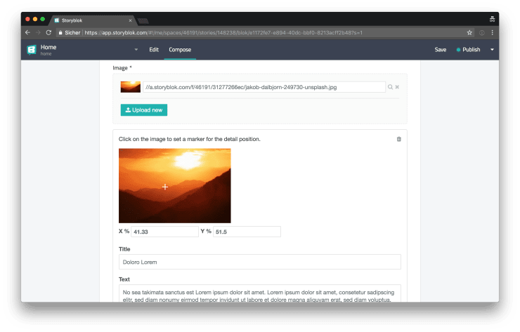
Click on the image to set a marker for the detail position.
</p>
<div class="detail-picker">
<img
:src="
augmentedImage.replace(
'a.storyblok.com',
'img2.storyblok.com/300x0',
)
"
@click="setCoordinates"
/>
<span :style="`top:${y}%;left:${x}%;`" class="detail-picker__marker" />
</div>
<div class="uk-flex tree__form-group">
<div>
<label class="form__topic">
X %
<input v-model="x" class="uk-form-small" @input="updateValue" />
</label>
</div>
<div class="uk-margin-small-left">
<label class="form__topic">
Y %
<input v-model="y" class="uk-form-small" @input="updateValue" />
</label>
</div>
</div>
<div class="tree__form-group">
<label :for="`title-${_uid}`" class="form__topic"> Title </label>
<input
v-model="title"
:id="`title-${_uid}`"
class="uk-width-1-1"
@input="updateValue"
/>
</div>
<div class="tree__form-group">
<label :for="`text-${_uid}`" class="form__topic"> Text </label>
<textarea
v-model="text"
:id="`text-${_uid}`"
class="uk-width-1-1"
rows="5"
@input="updateValue"
/>
</div>
<div class="tree__form-group">
<span class="form__topic"> Image </span>
<image-upload v-model="image" @input="updateValue" />
</div>
</template>
</div>
</template>
<script>
import ImageUpload from "./ImageUpload.vue";
export default {
components: {
ImageUpload,
},
props: {
augmentedImage: {
type: String,
required: true,
},
value: {
type: Object,
required: true,
},
},
data() {
// We use the values of the `value`
// property as the initial values
// of the fields of the component.
return {
image: this.value.image,
text: this.value.text,
title: this.value.title,
x: this.value.x,
y: this.value.y,
};
},
methods: {
setCoordinates(e) {
const { height, width } = e.target;
this.x = parseFloat((e.offsetX / (width / 100)).toFixed(2));
this.y = parseFloat((e.offsetY / (height / 100)).toFixed(2));
this.updateValue();
},
updateValue() {
this.$emit("input", {
image: this.image,
text: this.text,
title: this.title,
x: this.x,
y: this.y,
});
},
},
};
</script>There is a lot going on in the code above. Let’s take a look at it step by step.
In the template part of the code, you can see that we either inform the user that they have to upload a base image or, if a base image is already available, how they can add markers to the image by clicking on the image. We use an absolutely positioned <span> with its top and left CSS properties set to the y and x values of the model to display a marker in form of a white crosshair on the base image.
Whenever the user clicks on the base image, the marker is positioned at the exact position where the user has clicked by triggering the setCoordinates() method. The setCoordinates() method extracts the width and the height of the image and also the X and Y offset of the mouse from the click event object and uses those values to calculate the x and y values.
Further down in the template, you can see the various fields for the x and y values, a title, a text and an additional image. All of those fields trigger the updateValue() method when their value changes. The updateValue() methods takes all relevant values of the component and emits them with an input event to trigger a model update on the parent component.
Integrating the image detail component
The ImageDetail component was the last piece we need for finishing our augmented image plugin.
<template>
  <div>
    <image-upload v-model="model.image"/>
-   <!-- image details -->
+
+    <div class="blok__comp-container uk-margin-top">
+      <image-detail
+        v-for="(detail, index) in model.details"
+        :key="index"
+        :augmented-image="model.image"
+        v-model="model.details[index]"
+      />
+    </div>
   </div>
 </template>

 <script>
+import ImageDetail from './ImageDetail.vue';
 import ImageUpload from './ImageUpload.vue';

 export default {
   components: {
+    ImageDetail,
     ImageUpload,
   },
   mixins: [window.Storyblok.plugin],
Above you can see that we iterate over the details property of our model and render an ImageDetail instance for every entry. By binding the detail entry with v-model we allow the ImageDetail component to update the value of the plugin.
Adding and removing details
Last but not least there are only two things missing: adding new details and removing existing ones.
     <div class="blok__comp-container uk-margin-top">
       <image-detail
         v-for="(detail, index) in model.details"
         :key="index"
         :augmented-image="model.image"
         v-model="model.details[index]"
+        @remove="removeDetail(index)"
       />
     </div>
+
+    <a
+      class="blok__full-btn uk-margin-small-top uk-margin-bottom-remove"
+      @click="addDetail"
+    >
+      <i class="uk-icon-plus-circle uk-margin-small-right"/> Add detail
+    </a>
   </div>
 </template>

 <script>
 import ImageDetail from './ImageDetail.vue';
 import ImageUpload from './ImageUpload.vue';

 export default {
   // ...
   methods: {
     // ...
+    addDetail() {
+      this.model.details.push({
+        image: '',
+        text: '',
+        title: '',
+        x: 0,
+        y: 0,
+      });
+    },
+    removeDetail(index) {
+      this.model.details = this.model.details.filter((_, i) => i !== index);
+    },
   },
 };
 </script>
We now listen for a remove event on the ImageDetail component and call the removeDetail() method whenever an event is triggered. Next we add a new button for adding new details, which calls the addDetail() method when it’s clicked.
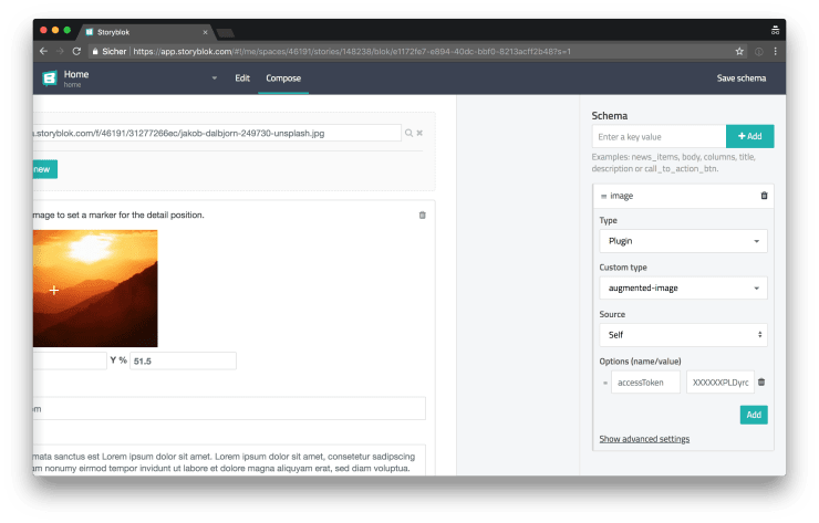
Configuring and using the plugin
Now that our plugin is ready, if you followed the official guide for setting up your plugin development environment, we can run npm run build to build our component. After running the build command, you can copy the contents of the newly created dist/export.js and paste it into the online Storyblok plugin editor.
Because our plugin needs to send an authorization header for uploading images, we have to provide an access token to our plugin. You can add the access token option when configuring the schema of the field provided by the plugin.
Consuming the data from the Storyblok API
After adding and configuring the new field provided by our plugin to one of our Storyblok components or Bloks, we can start to add augmented images to our content and we can fetch it via the Storyblok API the same way as all the other content provided by the regular Storyblok fields and plugins.
If you want to learn more about how to fetch data from the Storyblok API in Vue.js or Nuxt.js, you can read my previous article about this topic. Or you can check out the code, for the demo application featuring the augmented image plugin, on GitHub.
Wrapping it up
In my previous article I called Storyblok and Vue.js a prefect match. After further exploring the possibilities of the Storyblok plugin system, I can only emphasize this statement: if you happen to be a Vue.js developer, planning on settling for a headless CMS, Storyblok might be the perfect solution for you.