Break out of CSS Grid: Align Image or Background at the Edge of the Screen
Break out of CSS Grid: Align Image or Background at the Edge of the Screen
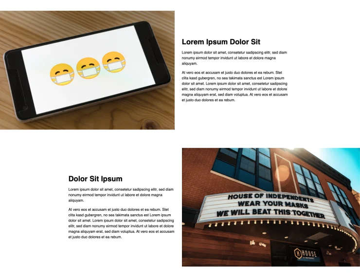
In the following screenshot, you can see a popular pattern for landing pages: repeating sections of an image on the one side and text on the other side where the image reaches the edge of the screen.

There are a couple of ways how we can achieve something like this, but if you want to align the text block precisely to a 12 column grid, things can get a little bit tricky.

Fortunately, thanks to CSS Grid, we can now solve this layout relatively easy.
See the Pen Break out of CSS Grid and Align Image at the Edge of the Screen by Markus Oberlehner (@maoberlehner) on CodePen.
If you look at the code of the CodePen above, you can also see that we implemented a fallback for browsers which don’t support display: grid.
Align a Background at the Edge of the Screen
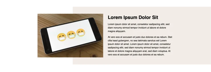
Let’s take a look at a slightly different variant of the same problem you can see in the following screenshot.


In the second screenshot, you can see that the image, the block of text, and the background perfectly align to a 12 column grid.
See the Pen Break out of CSS Grid and Align Background at the Edge of the Screen by Markus Oberlehner (@maoberlehner) on CodePen.
As you can see, the solution to this is very similar to the first example.
Wrapping it up
Thanks to CSS Grid, we can do many things that were impossible to achieve with Flexbox and other techniques. But this comes at the cost of a slightly more complicated syntax.