Would you like to buy me a ☕️ instead?
In recent weeks I played around with a ton of headless content management systems. To cut a long story short: there are a lot of bad and a couple of pretty good ones out there. At the end of my journey, I was left with two systems I both very much enjoy: Contentful and Storyblok.
Contentful is beautiful and the UI is very intuitive. But it lacks one major feature which is important to me: repeatable grouped fields. Additionally, the pricing is just a bit too much in my opinion. I can’t expect my clients, who are used to get Wordpress “for free”, to pay $ 39 each month. You can read my article about building headless CMS powered Vue.js landing pages if you’re interested in building websites with Contentful.

The Contentful user interface
Storyblok, on the other hand, is very powerful and provides all the basic features I’d expect from a CMS, out of the box. Furthermore it is possible to extend its functionality by adding custom field type plugins, which are basically regular Vue.js components. The pricing is amazing. Even the free plan is plenty if you just get started and for $ 14 / month you basically get everything you need for your typical small business website – that’s a lot closer to what small businesses are used to pay for hosting their website. Having said that, I also have to say that the UI is a lot less intuitive and just doesn’t look as polished as the gorgeous UI of Contentful.
If you are curious about the result, you can take a look at a demo of the application we’re going to build, hosted on Netlify or you can check out the code at GitHub.
Storyblok + Vue.js = a perfect match
One problem with a lot of the headless CMS platforms out there is a lack of flexibility. You might be fine as long as you’re building very simple websites but things can become really complicated as soon as you’re encountering a situation where you might need something more complex than a regular input or textarea field for some very specific part of your clients website.
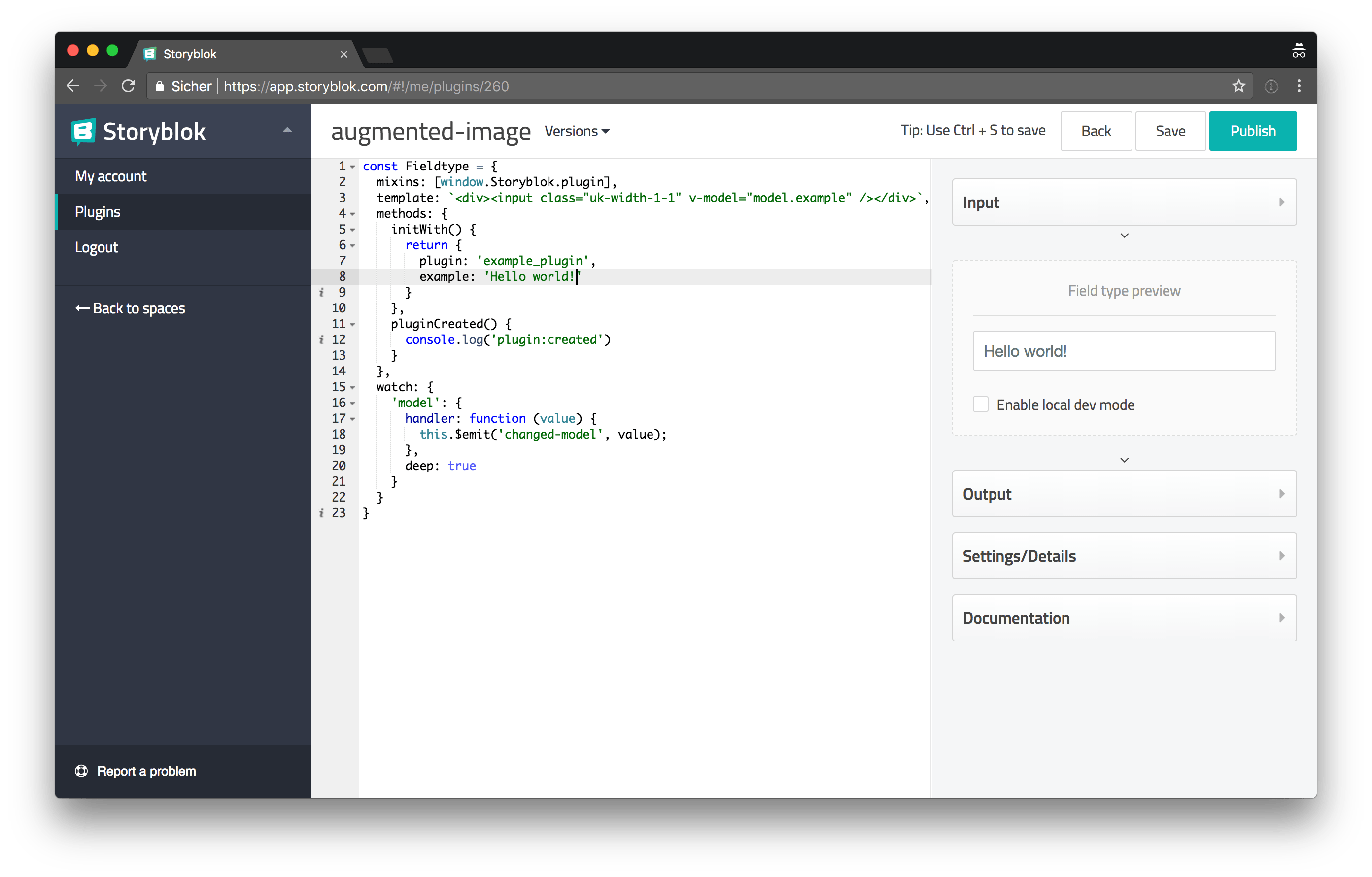
The Storyblok plugin editor
That’s where Storyblok really shines. Thanks to its flexible plugin system you’re able to extend its functionality with custom plugins which are based on Vue.js components. This makes Storyblok the perfect headless CMS for Vue.js developers. You can utilize your Vue.js skills for extending your CMS by building custom plugins with all the power of regular Vue.js components.
In today’s article, we’ll focus on how to set up a very basic page with Storyblok but in one of my next articles, we’ll take a closer look at the Storyblok plugin system and we’ll build our own custom field type plugin with Vue.js.
Setting up Nuxt.js
In my recent article about pre-rendering Vue.js websites, we explored how to add pre-rendering to an existing Vue CLI powered application. Today we’re going to build a simple, pre-rendered website with Nuxt.js and Storyblok. Nuxt.js provides a lot of the things, we’d had to configure ourselves in the previous article, out of the box. Furthermore, Nuxt.js also has SSR already built in, without any additional configuration required.
Because in this article, I want to focus on pre-rendering and how to integrate Storyblok into Nuxt.js, I don’t want to waste any time with explaining how to set up a Nuxt.js. You can check out the official documentation or you can clone the GitHub repository of this project to get going.
Do you want to learn more about advanced Vue.js techniques?
Register for the Newsletter of my upcoming book: Advanced Vue.js Application Architecture.
Storyblok components
Before we dive into the code, let’s start with setting up the Storyblok components for the content of our little website.
The Landing Page component
First we create a new component with the name landing_page and we configure it to act as a content type by checking the corresponding checkbox. Also we uncheck the “Nestable” setting because we don’t want to nest landing pages in other content types.
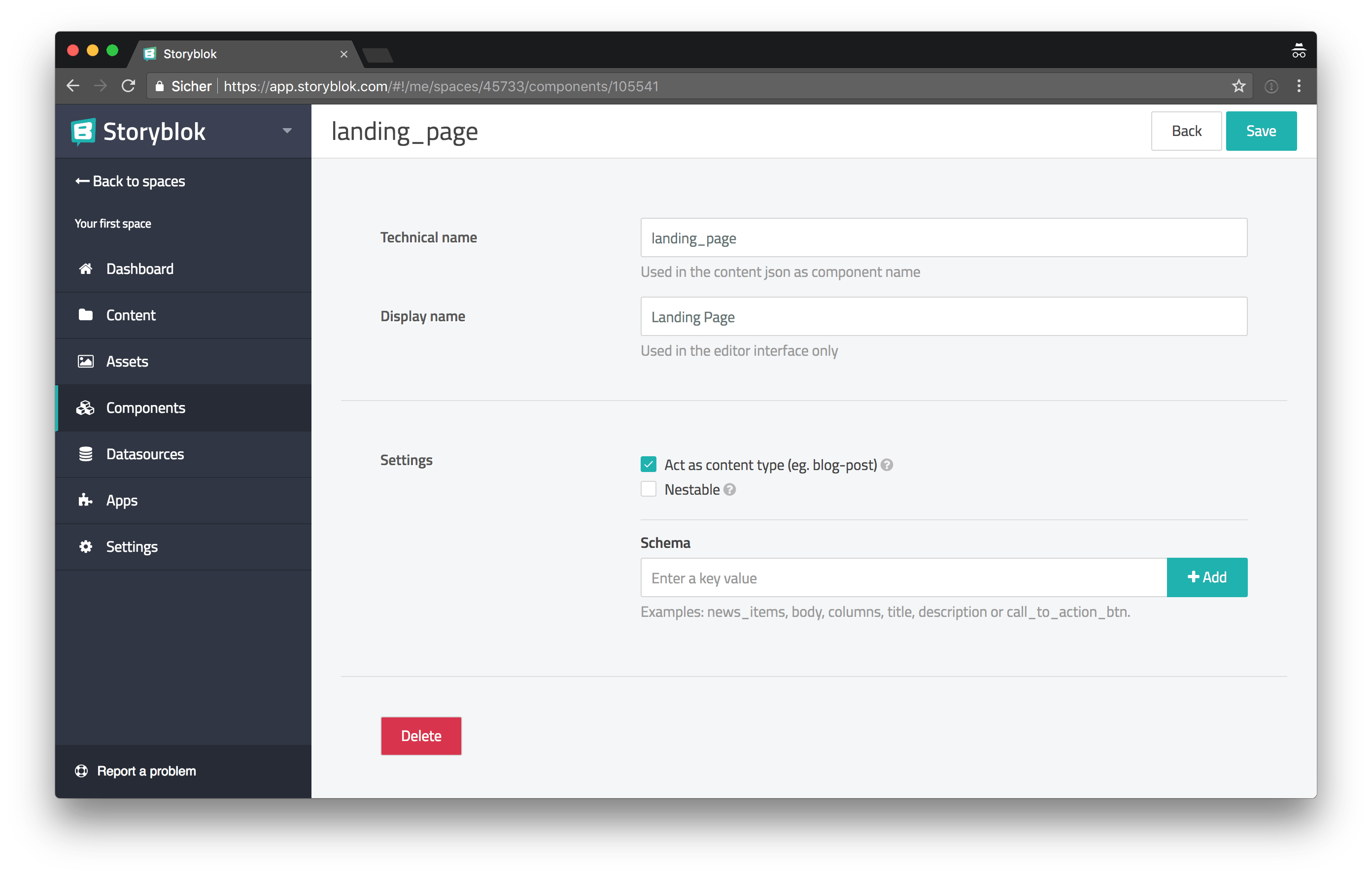
The Storyblok Components interface
Next we can start to add “Schemas” (or fields) to our landing page component. For the beginning we add two fields: Title and Intro.
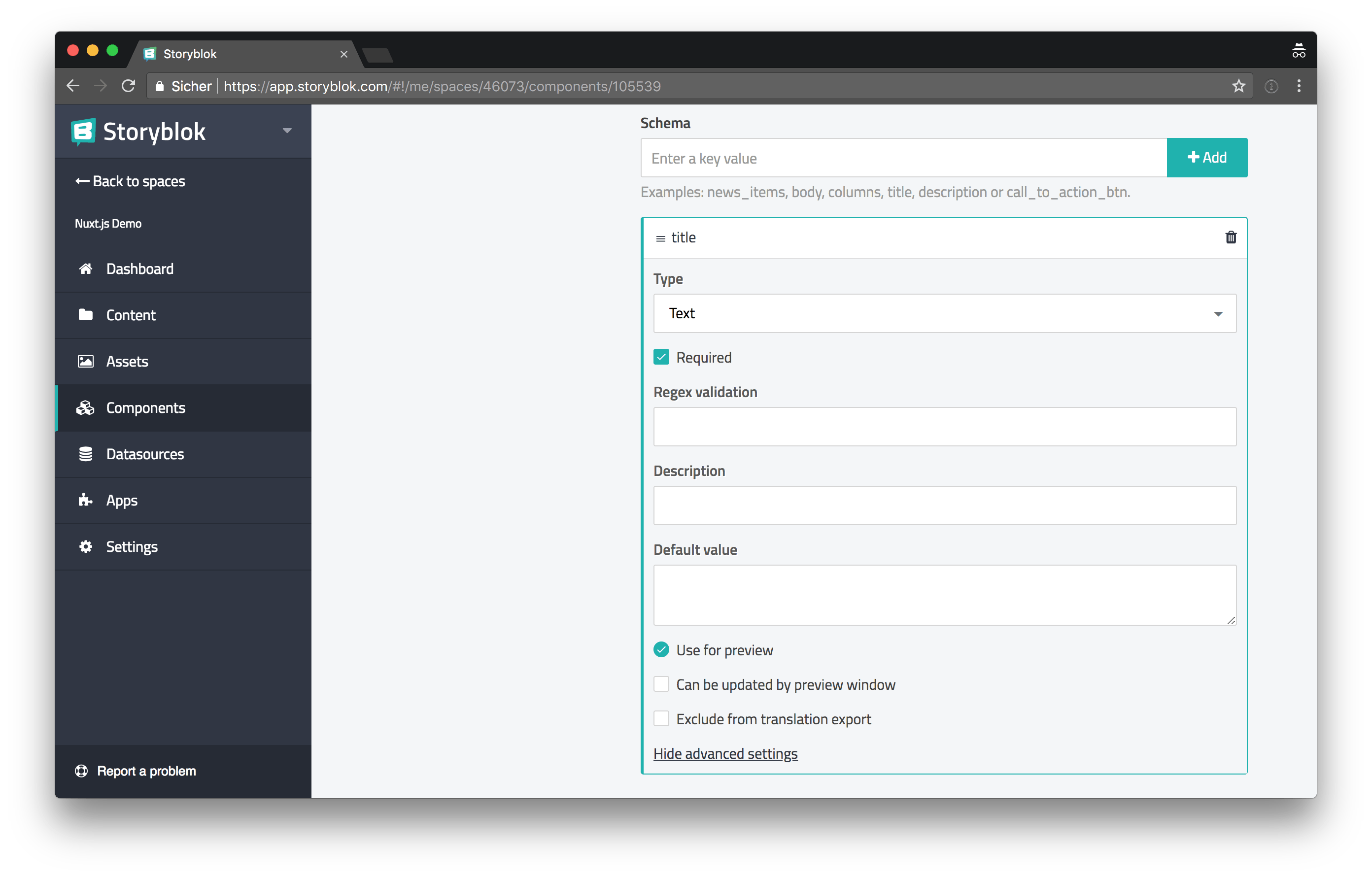
Adding new fields
Using blocks
Our landing page should not only consist of a title and an intro text but also of an arbitrary number of sections with alternating “image on one side and text on the other side” content blocks. And additionally we want to display the stereotypical three teasers section on the bottom of the page.
That's how our app should look at the end
The best way to achieve this with Storyblok is to create separate components for those two sections which we than can integrate into our landing page via the “Blocks” schema.
The Media Block component
To achieve the image + text layout, we create a new “Media Block” component. Our Media Block component needs several fields. We want to display a title, some text and an image. Additionally it should be possible to specify the position of the image (to the left or the right of the text). In the screenshot you can also see a field named image_group, we use the Group schema to group together the image and the image_position fields.
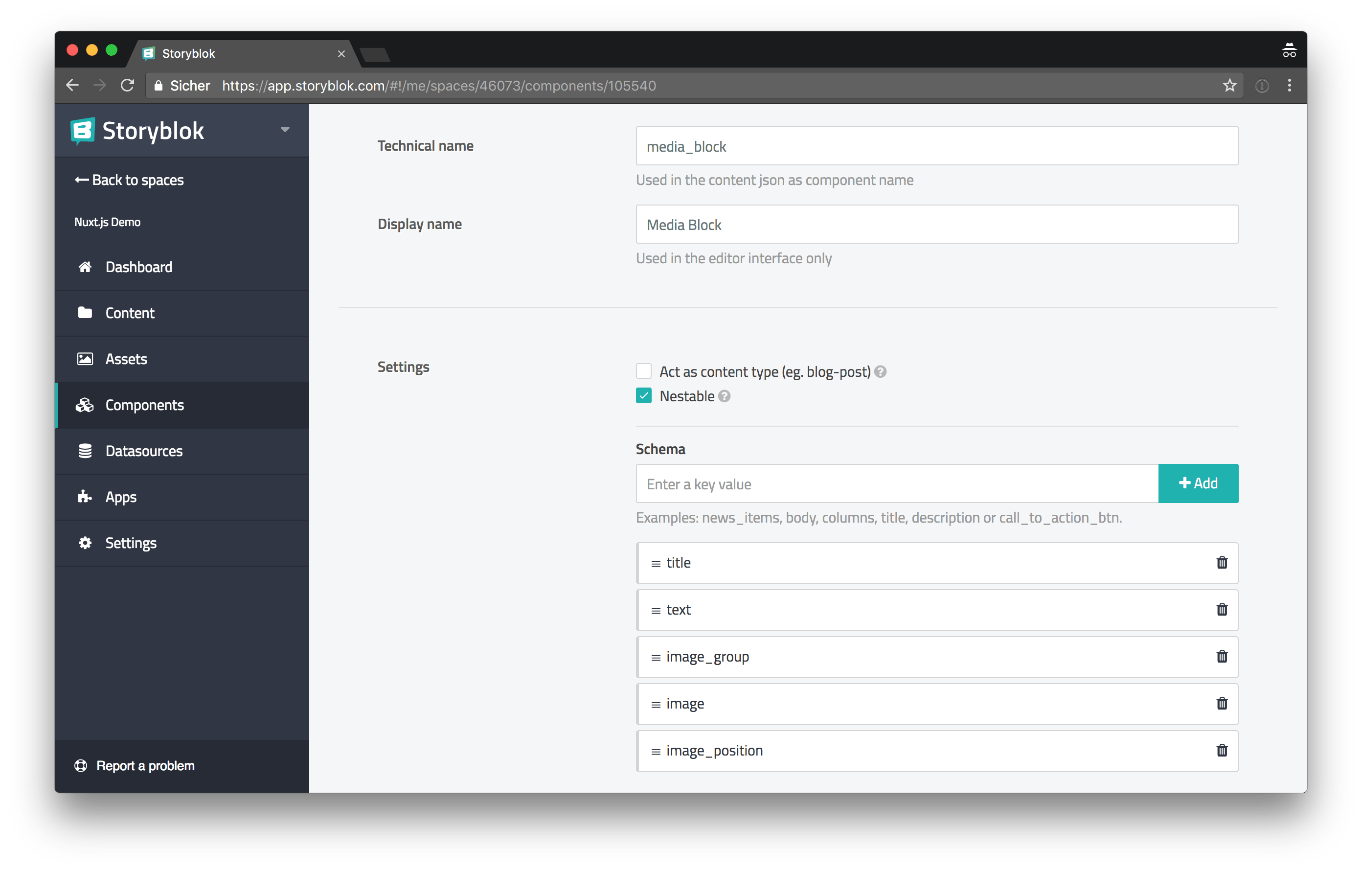
The Media Block component
The Teaser component
The Teaser component is pretty similar to the Media Block component but instead of an image_position field, we add a link field for a call to action button.

The Teaser component
Adding the components as blocks to the landing page
Now we can integrate our new Media Block and Teaser components into the Landing Page component. We do so by adding a new “Blocks“ field schema for each of the two components to the landing page component.
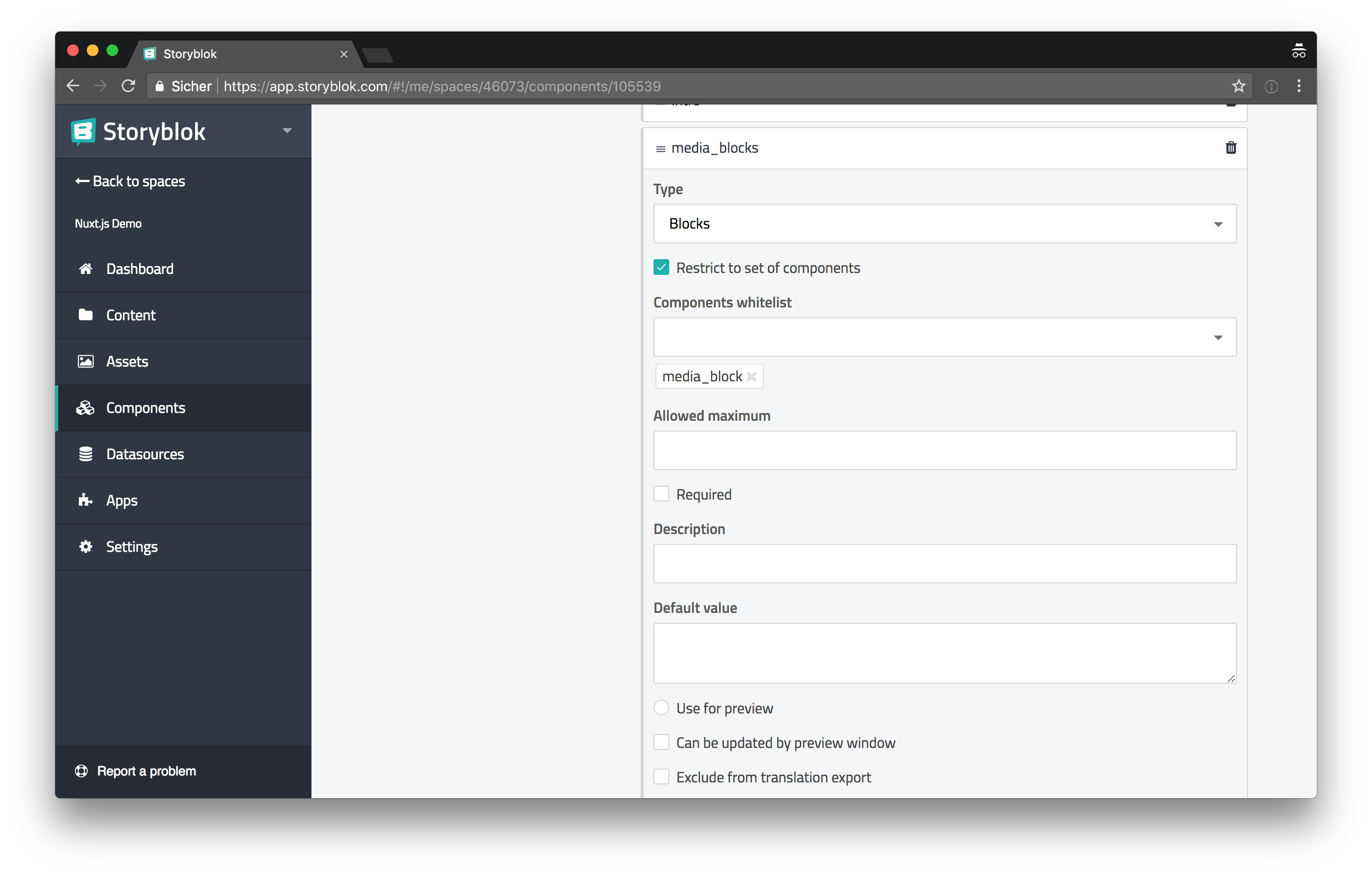
Adding a “Blocks“ field schema
You can see that we’re restricting the allowed set of components to only media_block items for the media_blocks field (and we also restrict the allowed components to teaser on the teasers field schema).
Adding a Landing Page in Storyblok
Lastly we add two new content entries of the type landing_page in the Storyblok CMS. We create a “Welcome!” entry to serve as our home page and an “About” page just so we have a second page for our application.

Adding a new landing page
Integrating Storyblok into a Nuxt.js application
Now that we’ve set up our headless CMS and we’ve entered all the data for our first two landing pages, we’re ready to start building a Nuxt.js application to display the data.
npm install storyblok-js-client --saveLet’s begin with installing the storyblok-js-client package which we’ll use to fetch data from the Storyblok API.
// utils/api.js
import StoryblokClient from  'storyblok-js-client';

export default new StoryblokClient({
  accessToken: 'pddNs27qfzRaUQw9ro7SSgtt',
  // We utilize caching. Depending on the
  // nature of your application, you might
  // not want to use caching yourself.
  cache: {
    clear: 'auto',
    type: 'memory',
  },
});
Next we create a new file in which we initialize a Storyblok client instance and export it so we can use it in multiple places of our application. You can find the public access token you can see above in the settings section of your Storyblok space.
Fetching data from Storyblok via Vuex actions
Finally we’re ready to get our hands dirty and make our first request to the Storyblok API. To make it easier for Nuxt.js to handle pre-rendering for us, we’ll use Vuex to fetch the data for our landing pages.
// store/modules/landing-page.js
import { GET_LANDING_PAGE } from '../action-types';
import { SET_LANDING_PAGE } from '../mutation-types';
import api from '../../utils/api';

// We use constants to store the
// slugs of our landing pages.
export const ABOUT = 'about';
export const HOME = 'home';

export default {
  namespaced: true,
  actions: {
    async [GET_LANDING_PAGE]({ commit }, slug) {
      const response = await api.get(`cdn/stories/${slug}`);
      const { story } = response.data;
      const id = story.uuid;
      const data = story.content;

      commit(SET_LANDING_PAGE, {
        id,
        intro: data.intro,
        title: data.title,
      });
    },
  },
  mutations: {
    [SET_LANDING_PAGE](state, landingPage) {
      Object.assign(state, landingPage);
    },
  },
  state: () => ({
    id: null,
    intro: '',
    title: '',
  }),
};
Above you can see the newly created store module for handling the data of our landing pages. Next we have to add the store module to our Vuex instance.
// store/index.js
import Vuex from 'vuex';

import landingPage from './modules/landing-page';

export default () => new Vuex.Store({
  modules: {
    landingPage,
  },
});
No we’re ready to build the view component for our homepage which accesses the Vuex store to get its data.
<template>
  <div :class="$options.name">
    <div :class="`${$options.name}__hero mb-4 mb-md-5 mx-auto text-center`">
      <h1 class="display-4">
        {{ title }}
      </h1>
      <p class="lead">
        {{ intro }}
      </p>
    </div>
  </div>
</template>

<script>
import { mapState } from 'vuex';

import { GET_LANDING_PAGE } from '../store/action-types';
// We import the `HOME` slug
// to use is later when triggering
// the action for loading the content.
import { HOME } from '../store/modules/landing-page';

export default {
  name: 'Home',
  computed: {
    ...mapState('landingPage', [
      'intro',
      'title',
    ]),
  },
  // The `fetch` method is called by
  // Nuxt.js before the component is
  // initialized. This is the right place
  // to fetch the data necessary for the
  // page to render.
  async fetch({ store, route }) {
    await store.dispatch(`landingPage/${GET_LANDING_PAGE}`, HOME);
  },
};
</script>
Above you can see the code of the homepage file pages/index.vue.
The current state of our application with title and intro text
Load and render the Media Blocks and Teasers
As you might remember, we’ve also created Media Block and Teaser components in Storyblok. Let’s update our code to render those as well.
 export const ABOUT = 'about';
 export const HOME = 'home';

+function adaptMediaBlock({
+  image,
+  image_position,
+  text,
+  title,
+  _uid,
+}) {
+  return {
+    id: _uid,
+    image: {
+      position: image_position,
+      url: image,
+    },
+    text,
+    title,
+  };
+}
+
+function adaptTeaser({
+  image,
+  link,
+  text,
+  title,
+  _uid,
+}) {
+  return {
+    id: _uid,
+    image: {
+      url: image,
+    },
+    link: link.url,
+    text,
+    title,
+  };
+}
+
 export default {
   namespaced: true,
   actions: {
       // ...
       commit(SET_LANDING_PAGE, {
         id,
         intro: data.intro,
+        mediaBlocks: data.media_blocks.map(x => adaptMediaBlock(x)),
+        teasers: data.teasers.map(x => adaptTeaser(x)),
         title: data.title,
       });
     },
   },
   // ...
   state: () => ({
     id: null,
     intro: '',
+    mediaBlocks: [],
+    teasers: [],
     title: '',
   }),
 };
In the diff above you can see that we’ve added two adapter functions which are responsible for mapping the data from the Storyblok API into a format which we can easily use in our Vue.js components. We’re using them by mapping over the media_blocks and teasers arrays returned by the API.
Next we make some updates to the pages/index.vue homepage component to render the media blocks and teasers.
         {{ intro }}
       </p>
     </div>
+
+    <div :class="`${$options.name}__media-blocks mb-5`">
+      <app-media-block
+        v-for="mediaBlock in mediaBlocks"
+        :key="mediaBlock.id"
+        v-bind="mediaBlock"
+      />
+    </div>
+
+    <ul :class="`${$options.name}__teasers mb-5`">
+      <li
+        v-for="teaser in teasers"
+        :key="teaser.id"
+      >
+        <app-teaser v-bind="teaser"/>
+      </li>
+    </ul>
   </div>
 </template>
 import { GET_LANDING_PAGE } from '../store/action-types';
 import { HOME } from '../store/modules/landing-page';

+import AppMediaBlock from '../components/AppMediaBlock.vue';
+import AppTeaser from '../components/AppTeaser.vue';
+
 export default {
   name: 'Home',
+  components: {
+    AppMediaBlock,
+    AppTeaser,
+  },
   computed: {
     ...mapState('landingPage', [
       'intro',
+      'mediaBlocks',
+      'teasers',
       'title',
     ]),
   },
Above you can see the changes necessary to render all of the data we’re fetching from Storyblok. You can see the full code of the homepage component, the AppMediaBlock component and the AppTeaser component in the GitHub repository of this article.
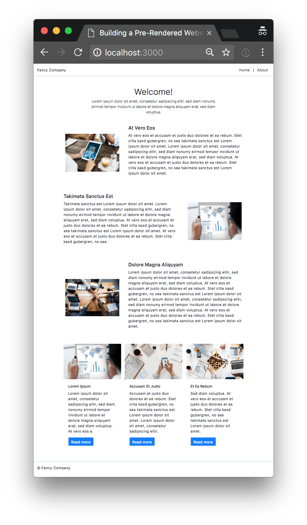
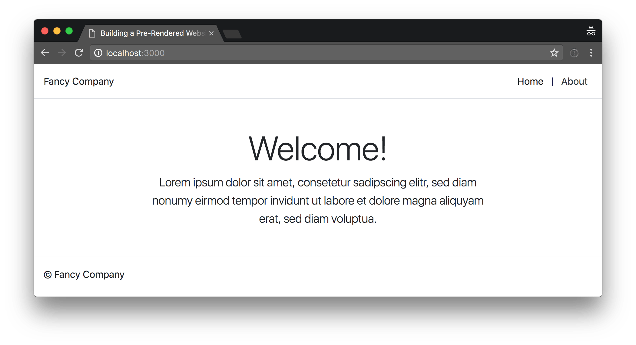
The final look of our landing page
Pre-rendering and SSR
Thanks to Nuxt.js pre-rendering and SSR are a matter of executing the right commands.
# Start the production server for SSR.
npm start

# Generate a pre-rendered static version.
npm run generate
With the two commands you can see above, you can either serve a server-side rendered version of your application or you can use the generate command to create a pre-rendered bundle, ready to be deployed on a static hosting service like Netlify.
Wrapping it up
Storyblok provides us with all the tools necessary to implement not only very simple websites, like the one we built in this article, but also very complex projects. Nuxt.js makes it very easy to create a pre-rendered bundle of our application which is not only important for SEO but it also makes it possible to build single-page applications that load very fast.
In my next article, we’ll explore how we can build our own Storyblok field type plugins with Vue.js.